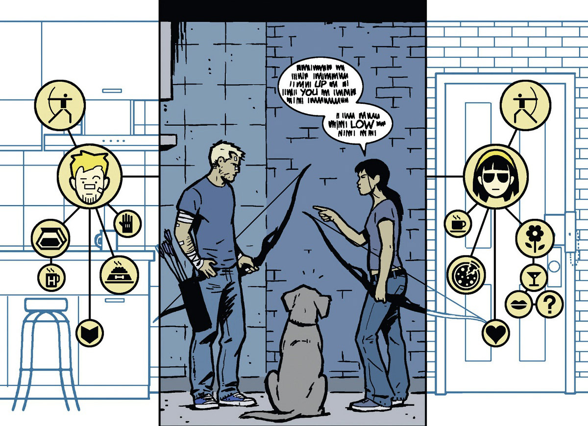
“Up”, “You”, and Low” The only three recognizable words spoken on this panel, the rest of the chat bubbles are scribbles, in fact not much else can be inferred from the dialogue, something unusual when reading a comic or graphic novel. But why would someone intentionally make the dialogue impossible to read?
Let’s try again, this time take a few minutes and slowly take in the whole image, examine each of the elements that compose this scene, without rushing take note of the hierarchy, rhythm, and flow that allows you to digest the information being conveyed.
Note the relationship being formed from the center area in full color and into the call out icons on each side over a contrasting space that allows it to flow downwards almost following a beat. All of these elements working together to drive you to where the story is presenting it’s perspective in order to understand what we are seeing.
So, now what do you notice? It was never the conversation we’re supposed to focus on, but the way the information is being narrated and understood through the eyes of the main protagonist of this story, the dog.
This is Lucky, or sometimes called Pizza, a supporting character of the critically acclaimed series Hawkeye by writer Matt Fraction’s and artist David Aja’s, this issue in particular was the winner of the Eisner Award in 2012 for Best Single Issue. If you ever pick up this issue it’s clear to see why, each page works with few dialogues or sometimes none at all, relying heavily on design elements that help showcase how powerful sequential art can be. To designers however, these are practices that we should be quite familiar with.
Think about the problem and the solution as a designer in the context of what is trying to be conveyed. A dog needs to communicate with the audience, and like any animal, Lucky cannot comprehend most of the sentences being spoken save or a few words which don’t bring much information to work from. He cannot engage in any sort of traditional monologue or exposition to convey what he is thinking. Putting chat bubbles on the dog would change the tone of the story where it should feel more grounded. If we can read what the animal is thinking, then it brings a sense of fantasy and can disconnect us from how the world he exists in is positioned.
So, how do we achieve an engaging exposition of thoughts and information that can be believable and grounded for an animal? Iconography, layout, and hierarchy. Through key symbols depicting and being depicted by the other characters, there is now descriptive information of each one. There is a hierarchy established to further explain who these people are, and establish Lucky’s relationship with each of them. Of course most of these elements would not work if not carefully positioned in a way that can guide the viewer into realizing what they are comprehending, so the entire image is made to work from the top center as a focal point, driven outwards and into the bottom of the center page to drive it’s point forward.
Design and comics share very similar roots, both tackle information and ideas, sometimes you might find a gem like this one and be able to appreciate it for what it’s worth, an exercise on good design. So next time maybe pick up a copy and take a glance, even for a minute and explore what else this issue has to offer.