I was introduced to this project at the beginning of this year with the major goal of rebranding a company by combining two brands into one. Additionally I would need to be able to apply it to all internal and external collateral materials, on both print and digital media.
The two companies presented existed within the payments industry, Edenred and Corporate Spending Innovations (CSI). While both companies were similar being in the same sector, their marketing and visual approach were on different ends.
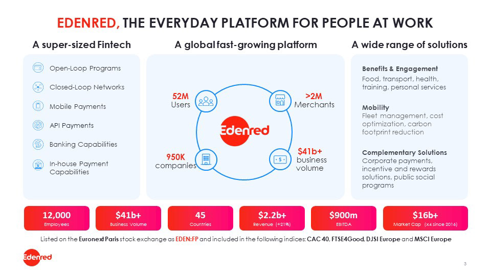
Edenred was more focused on the human experience as part of the user journey of their products and services with everyday transactions, all conveyed with lifestyle imagery and a wide palette of vivid colors.
CSI focused on the relief and increased productivity of a streamlined process in the work place, which visually relied on more technical diagrams, and dark colors to convey that message.
Combining brands tends to be a go to answer for many designers. The idea that by combining elements, you achieve a functional hybrid of the two. The issue with that answer is that it missed context.
Edenred bought CSI, they did not merge.
Corporate Payment Innovations was a US based payment solutions company which was bought in 2018 by global company Edenred.
For several years after they operated independently from Edenred with their own brand intact save for a small co-branded element on their client facing materials and some digital environments.
That lasted until 2022 when it was announced CSI would be fully integrated into the parent brand becoming Edenred Pay.
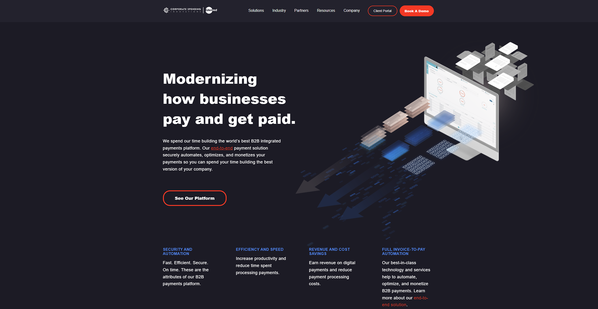
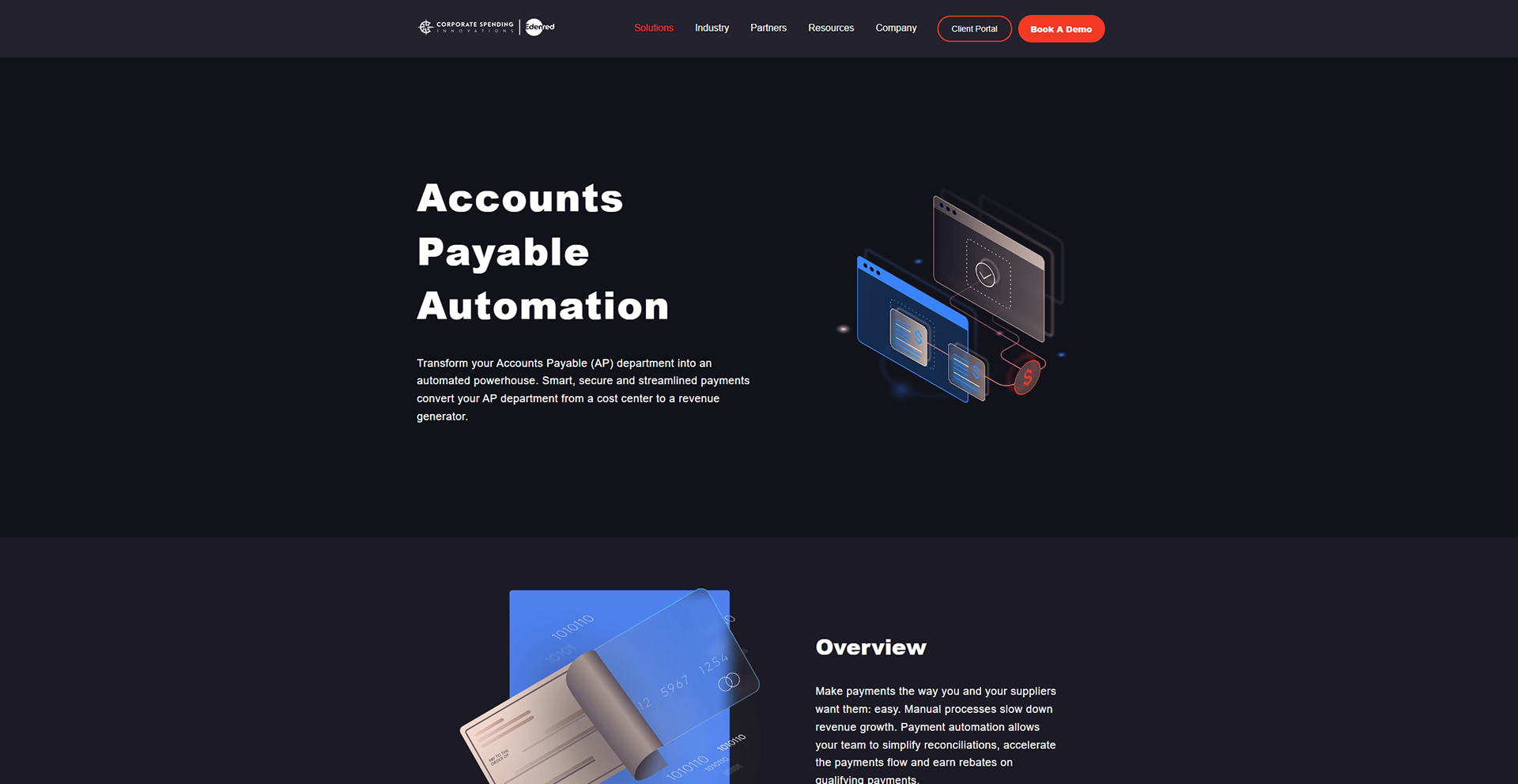
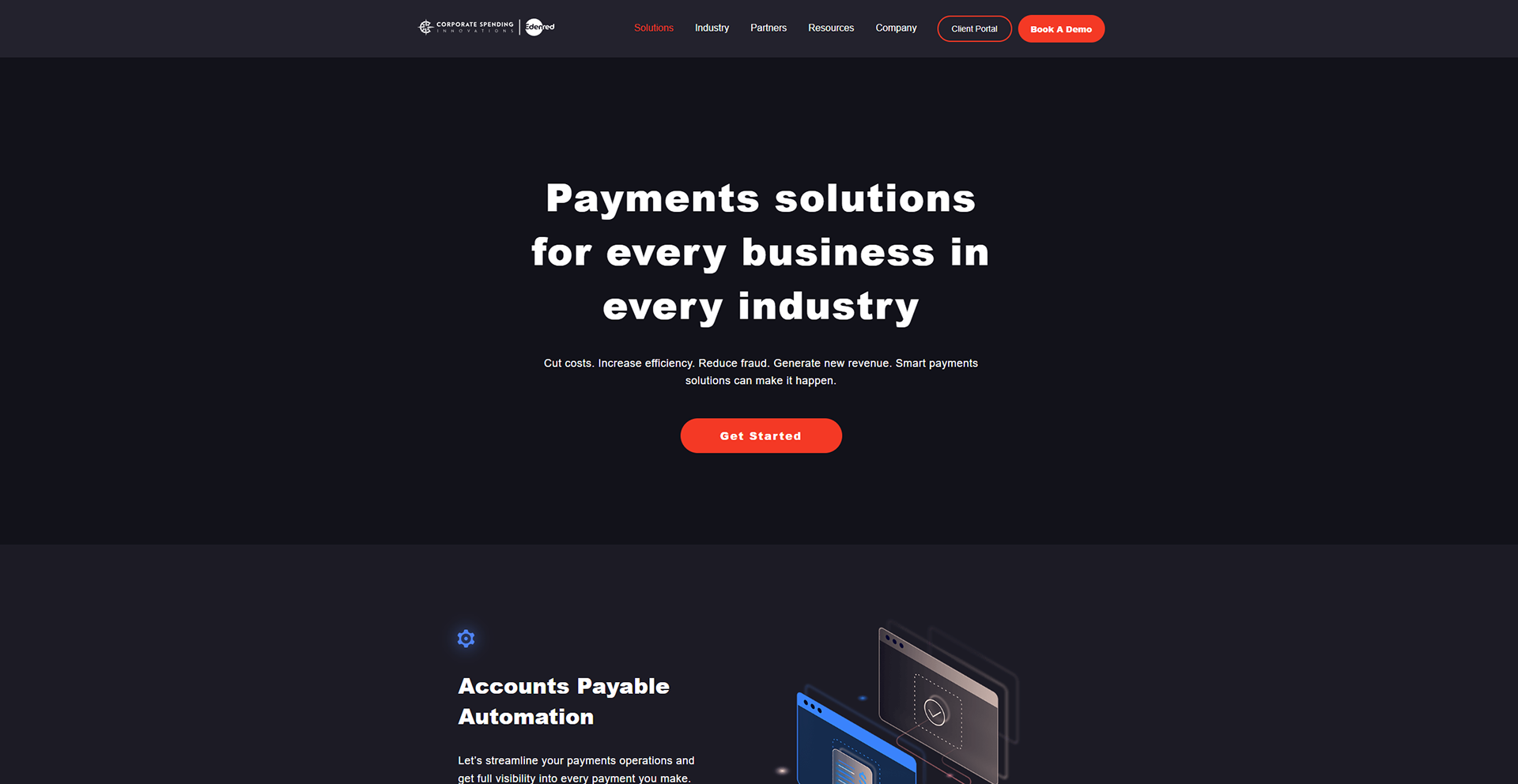
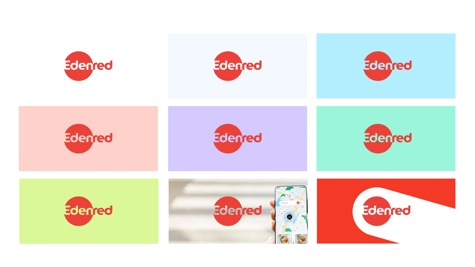
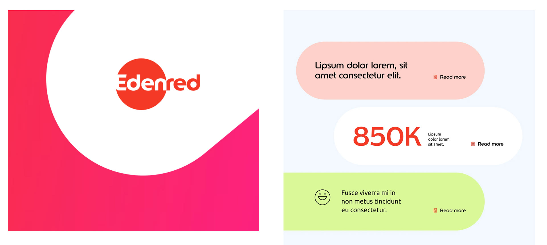
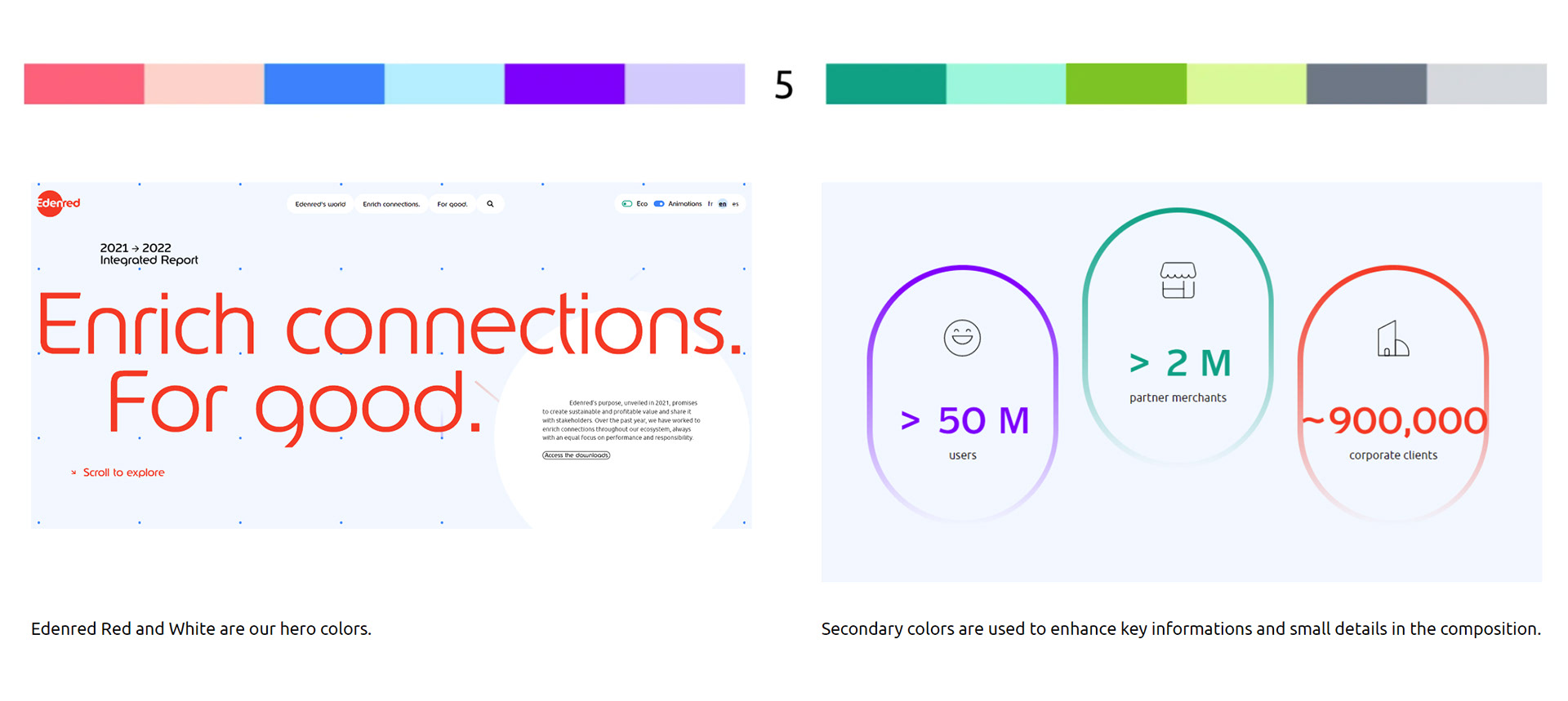
Understanding this helped me reframe the project as a rebrand via a master brand. Of course there was still a need to create some visual anchors that would help old and current clients feel a connection to the previous brand. So the approach I wanted to take, was by exploring a tone bleed effect.
When you have to distinct subjects that need operate by different rules in their own worlds, tone bleed helps one exist in the other by taking the traits and rules of it's world. In this instance, CSI needs to exist inside of the Edenred brand as Edenred Pay.
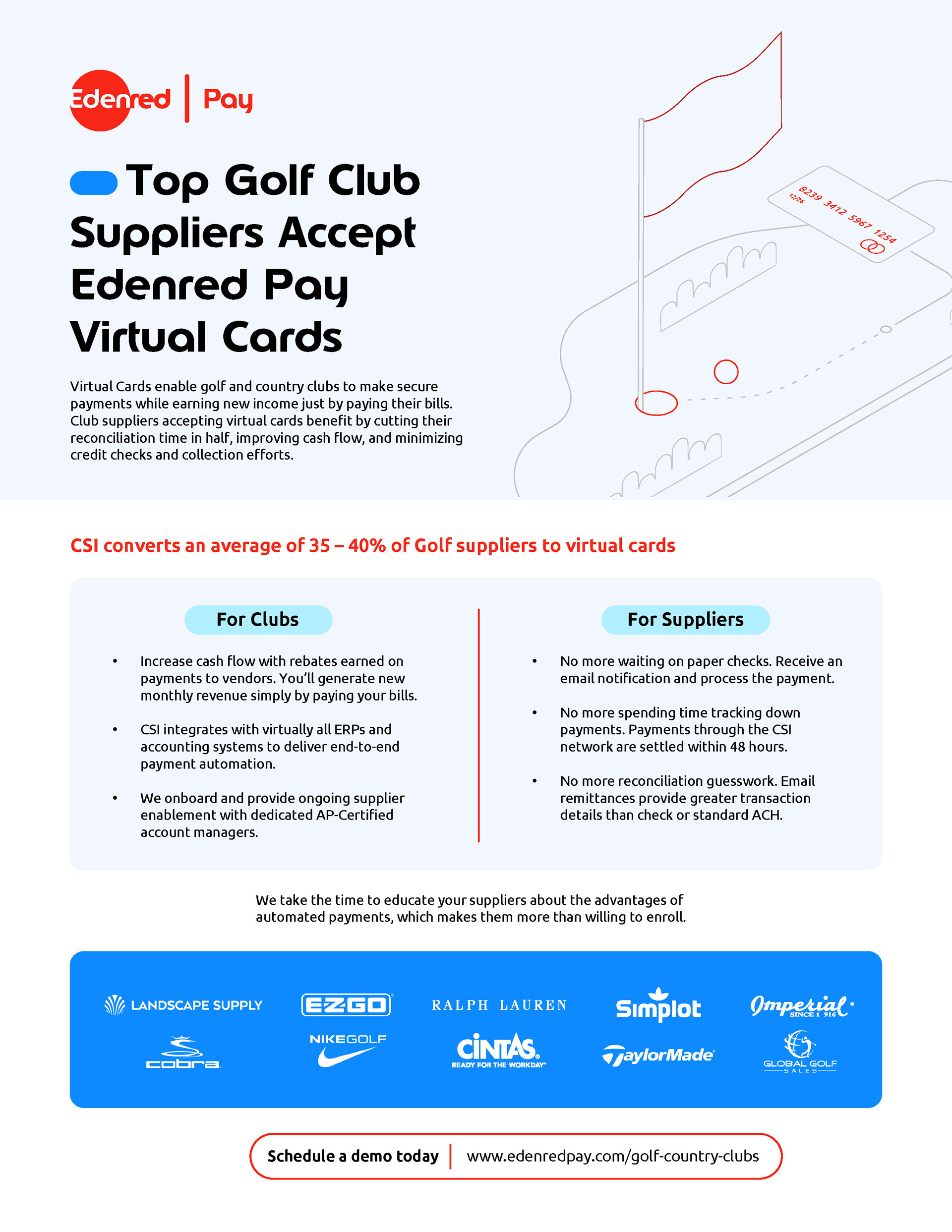
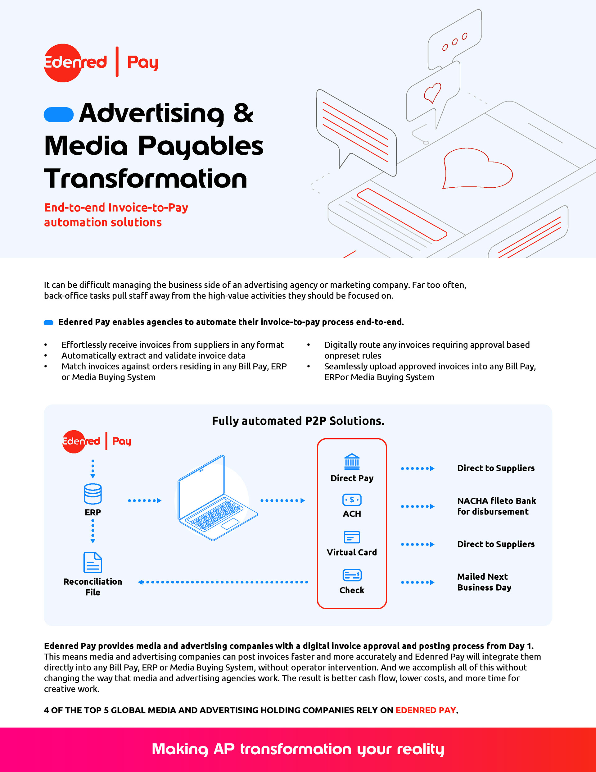
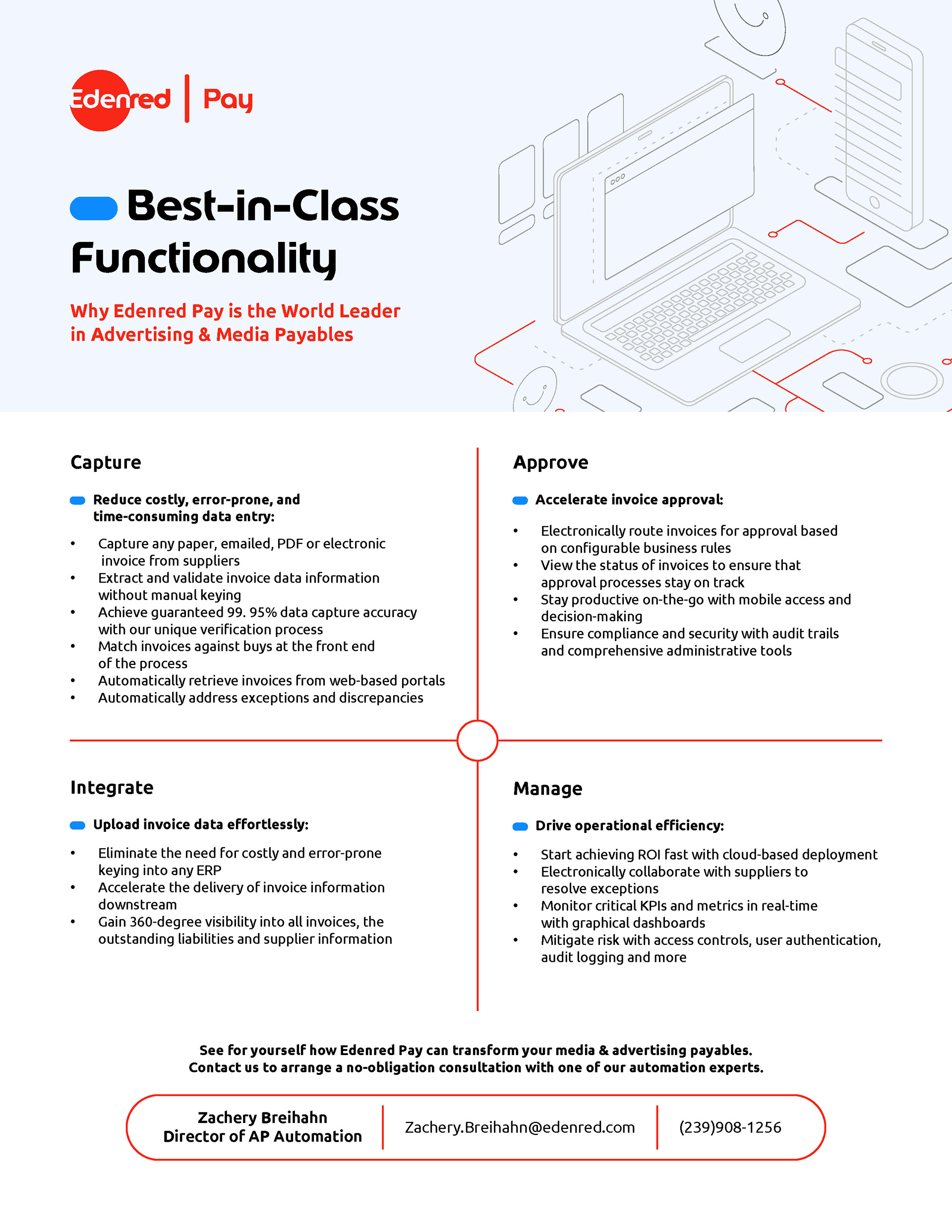
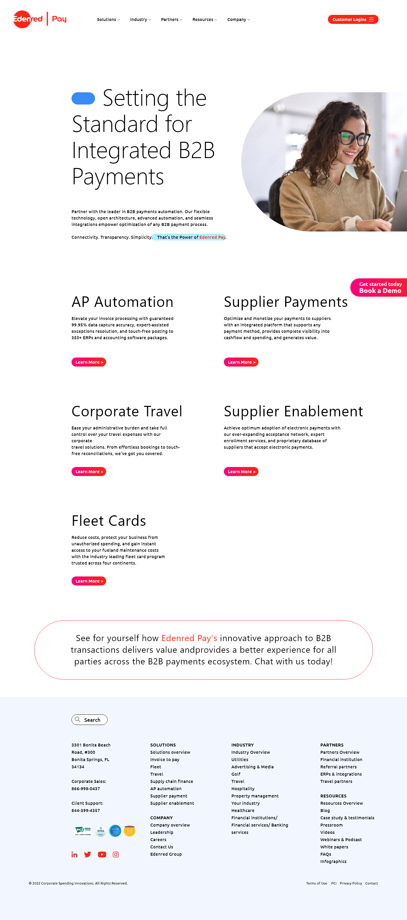
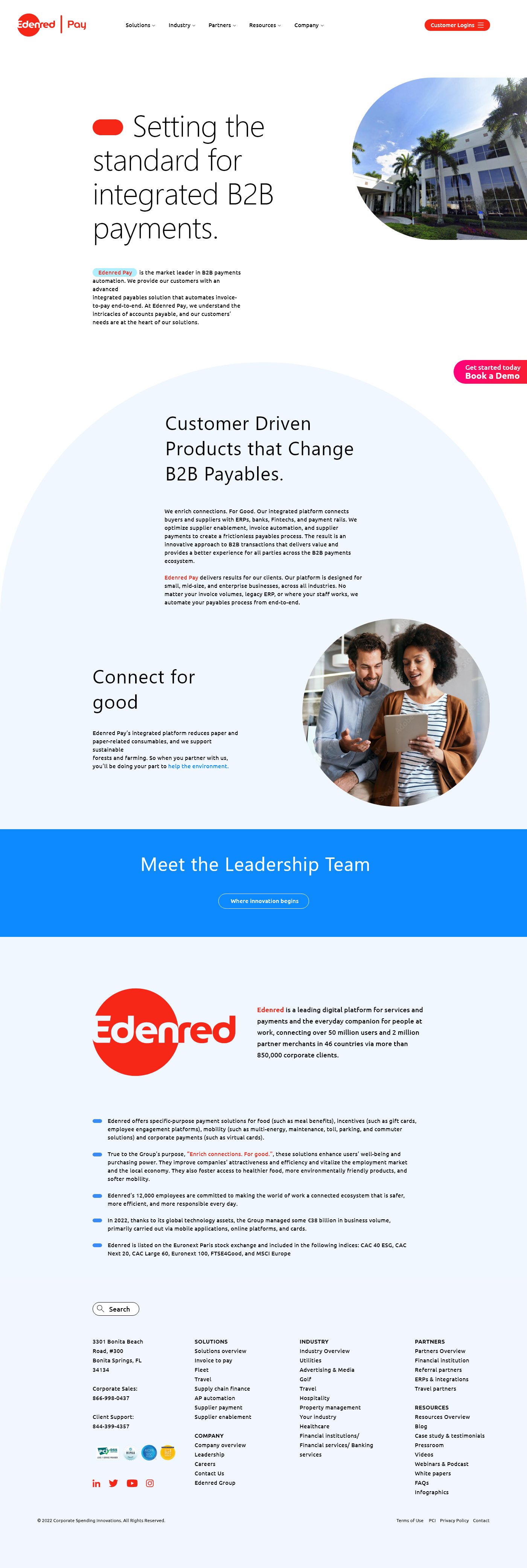
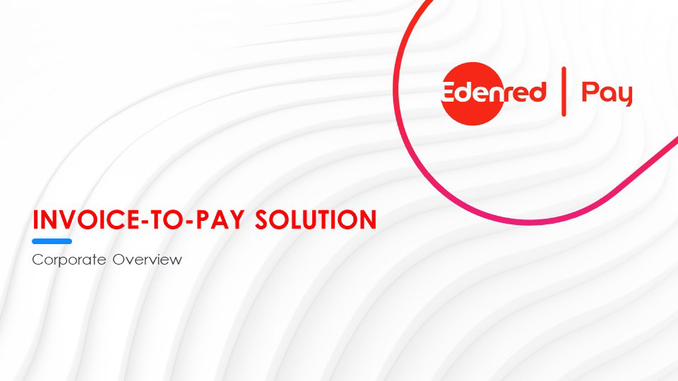
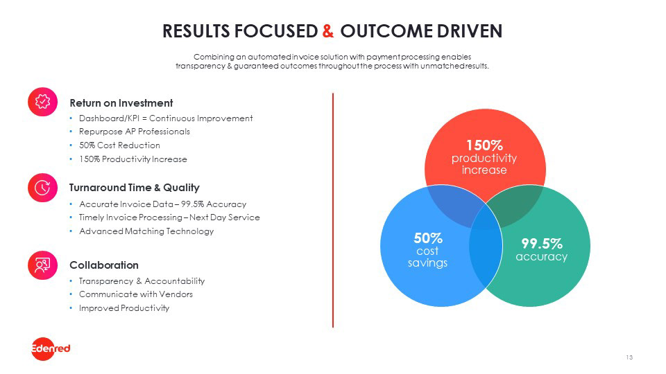
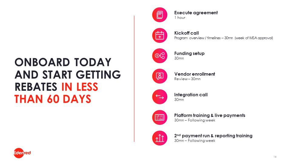
While elements were set up to resemble the Edened parent brand, there was a small change to them in terms of scaling back the amount of colors that could be used to talk about Edenred Pay. A more common use of the original light blue and dark blue colors were added as accents and in some cases on type against the now brighter backgrounds.
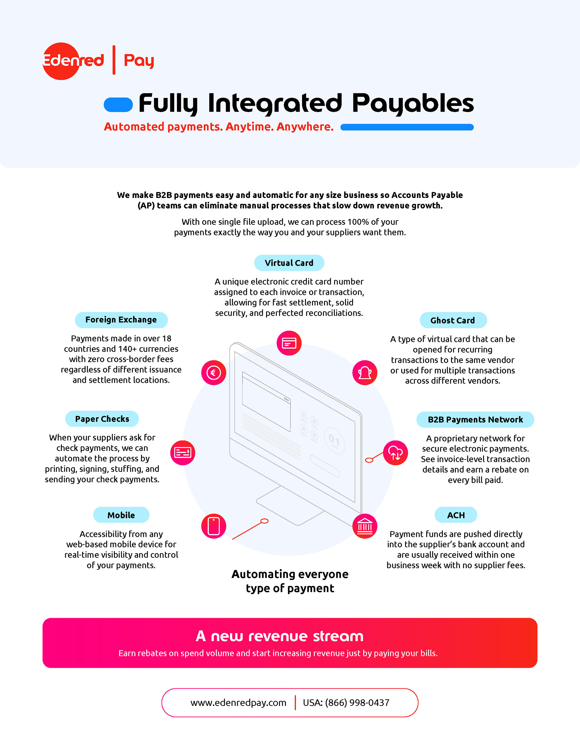
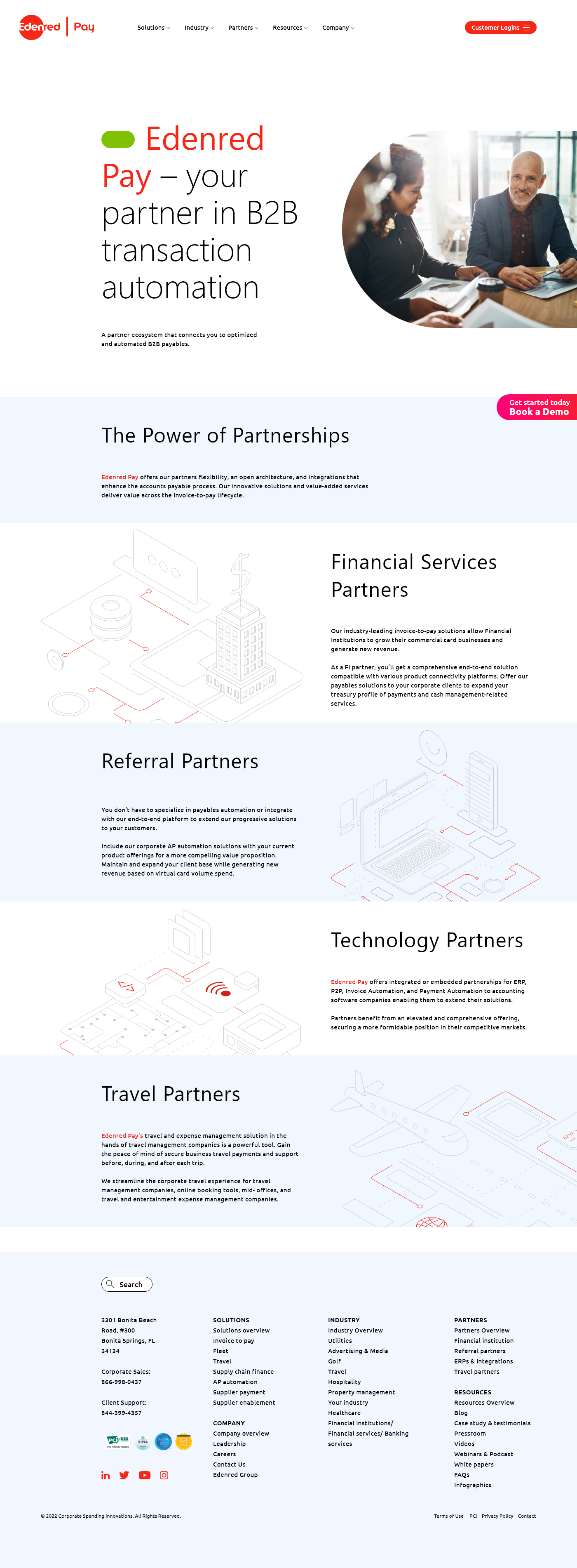
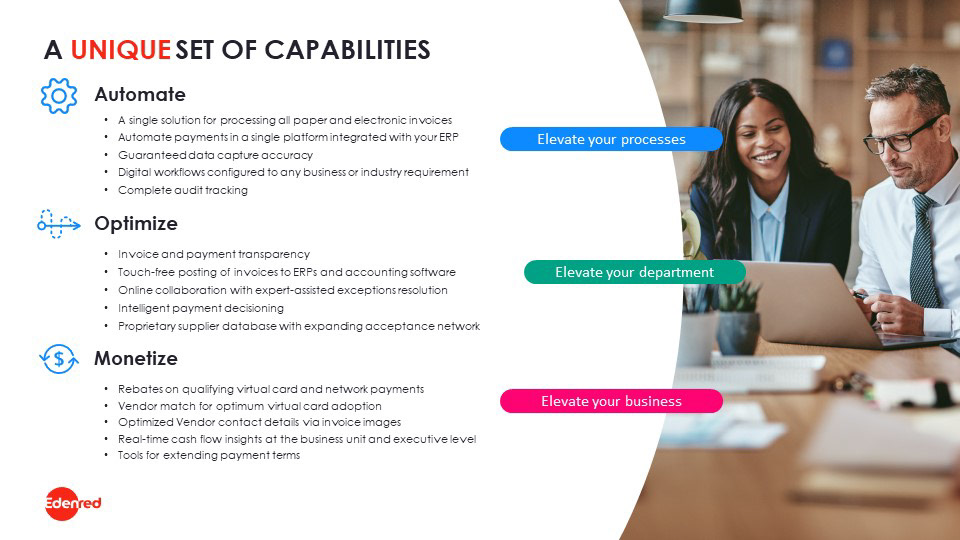
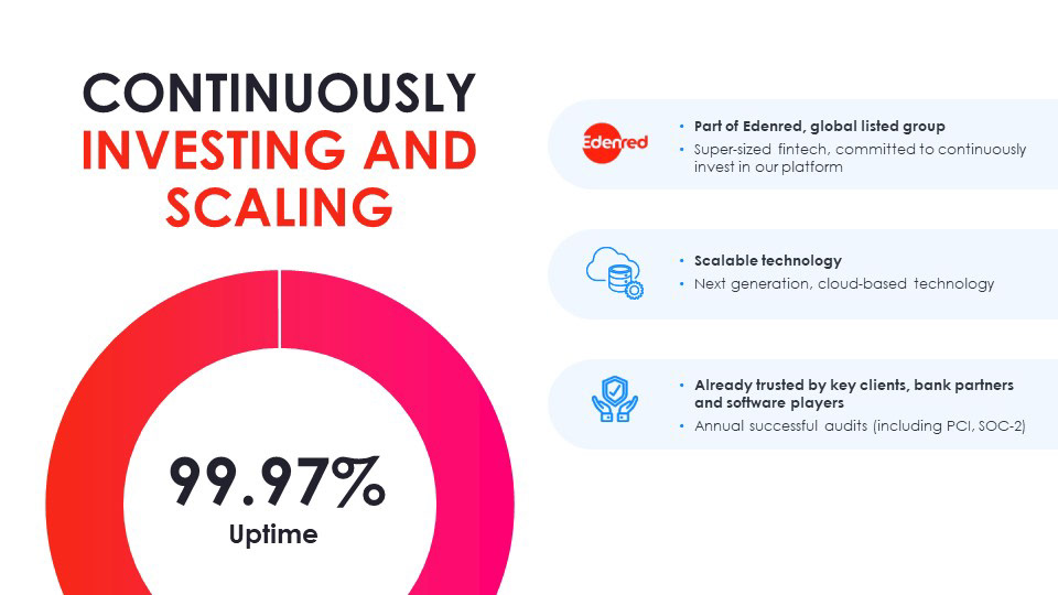
The images were now directed to be lifestyle but of people in the office as to invoke a more human and personal approach to who manages these applications. Soon the communications strategy begun to reflect this, painting new user journeys centered around payment administrators.
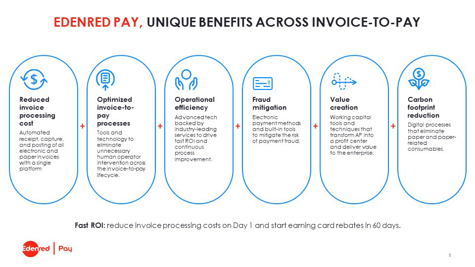
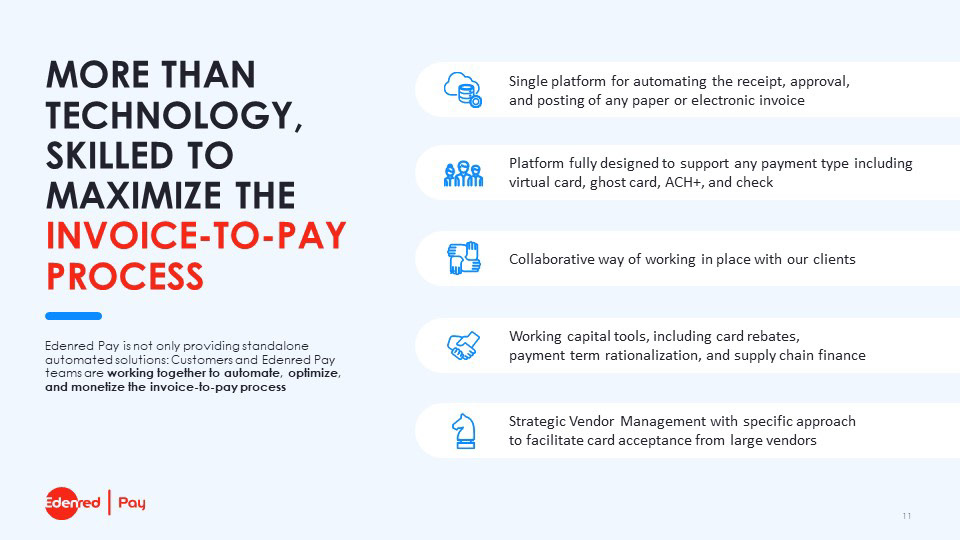
Iconography was set up to fill in gaps where images could not intuitively describe complex aspects of the product and services, while some illustrations were added to retain some additional familiarity.
The new Edenred Pay website showcases a lot of the ideas and work that went into applying a solution that was both praised by the owning brand, and the internal board, launching Edenred Pay's new identity forward.


So the solution at hand, was not the path that would help the brand find it's new voice.
