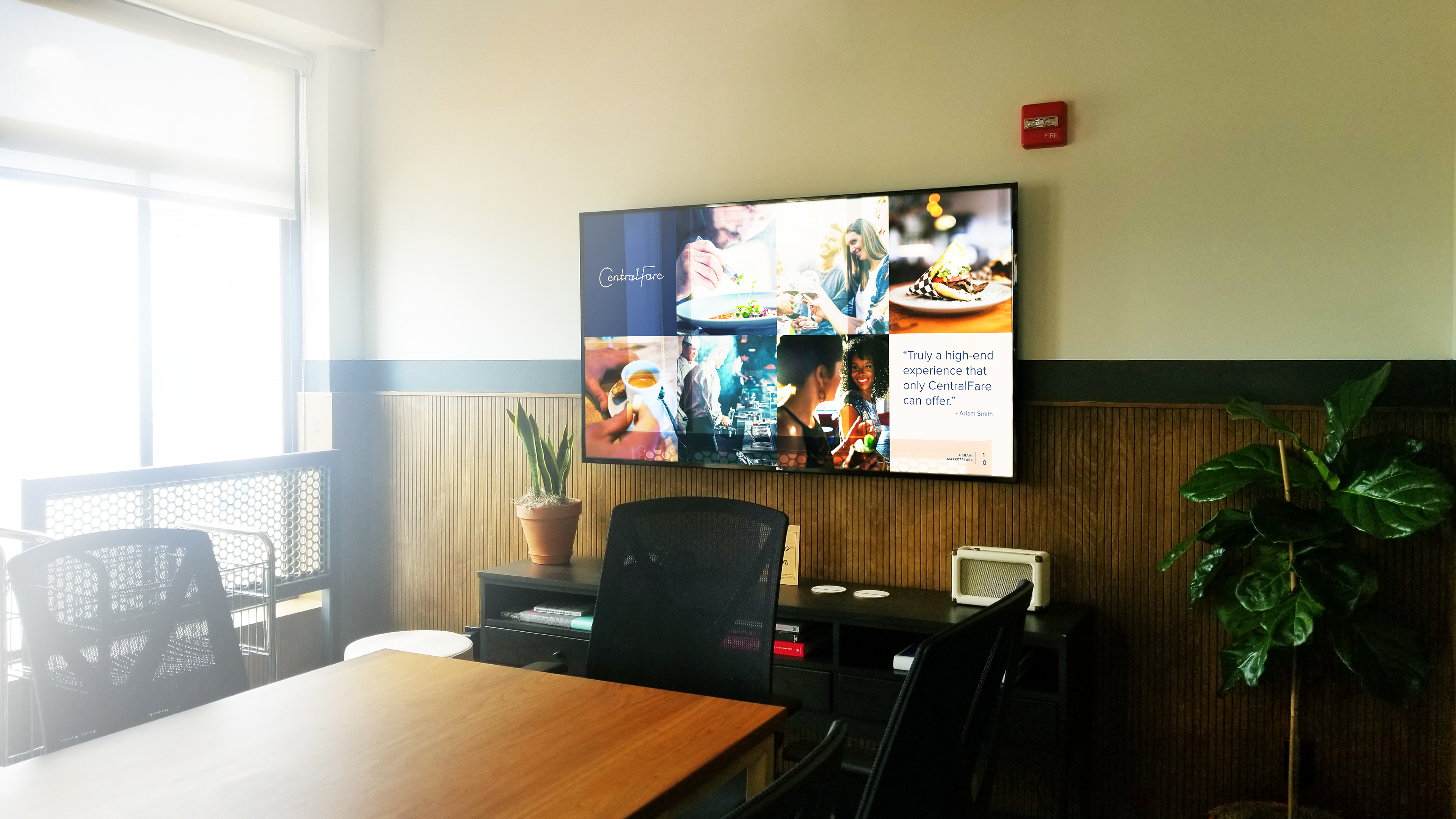
When I was tasked with creating a presentation guideline for Central Fare, I found out that their style guide was a short (7 pages long) with little to no mention of their visual hierarchy or typography. The project's website was possibly a bigger resource than the brand book itself. So I decided to take visual cues from their website, and their unused stock photo library to create something that would not only serve as the initial purpose, but to also serve as a n extended style guide for their brand. Showcasing grid layouts and images of people having good experiences rather than just the services or products, to emphasize a type of business that promotes experience first.
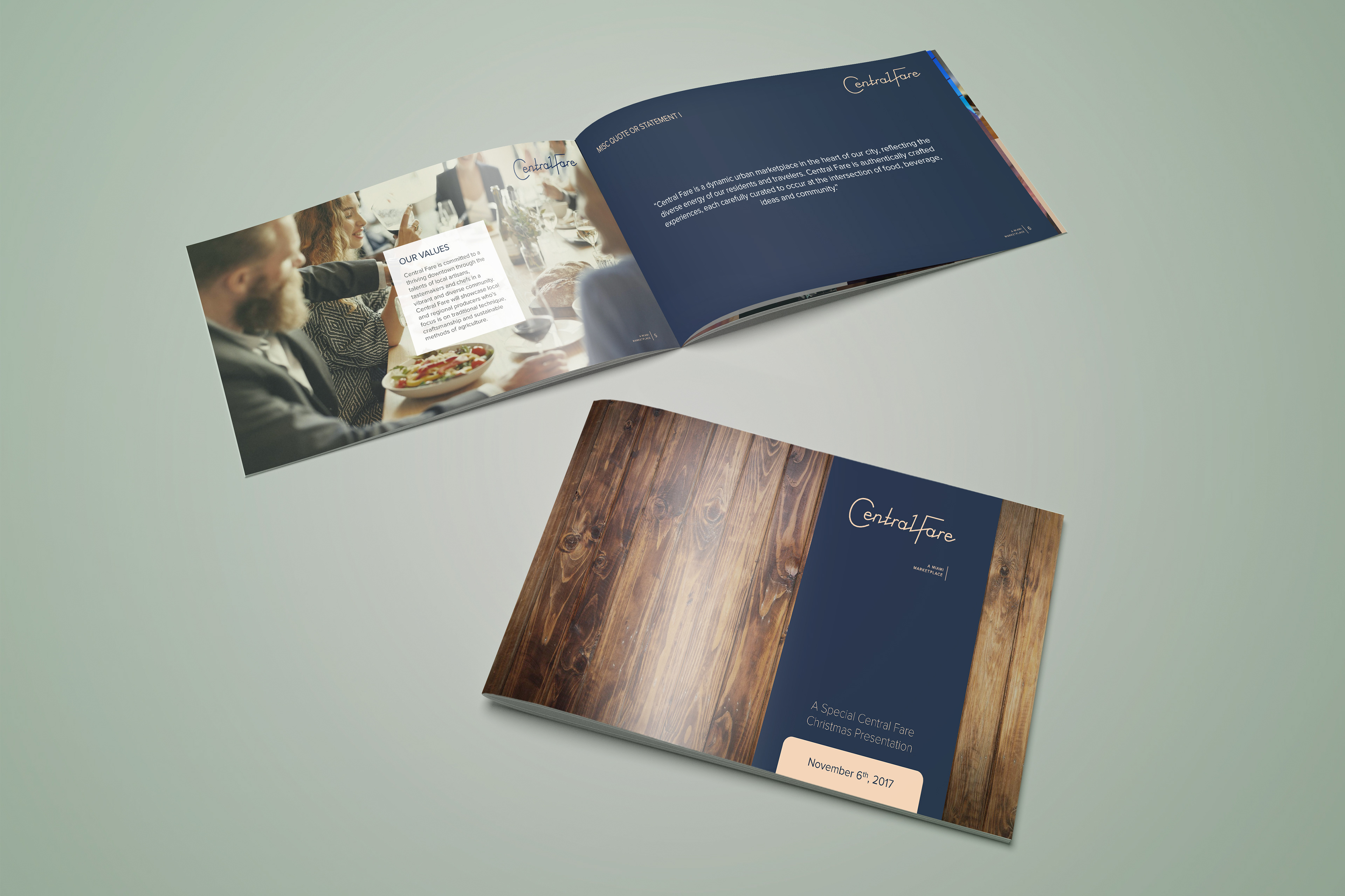
I was tasked with creating a presentation guideline for Central Fare. I found out that their style guide was brief (7 pages long) with little to no mention of their visual hierarchy or typography. The project's website was possibly a bigger resource than the brand book itself.

So I decided to take visual cues from their website, and their unused stock photo library to create something that would not only serve as the initial purpose, but to also serve as an extended style guide for their brand.
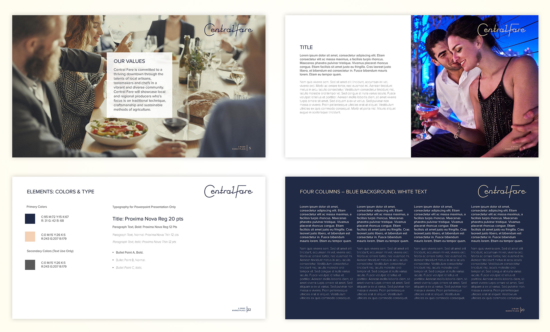
Showcasing grid-based layouts and images of customers enjoying their experiences rather than just the services or products, it helped emphasize a business that promotes experience first.