ABADesk is an online data collection application created for behavioral analysis by the start-up Mingo Solutions. When I joined their project, they expressed the need for help in their branding, and most of all, someone to assess and improve on the framework and experience of the application.
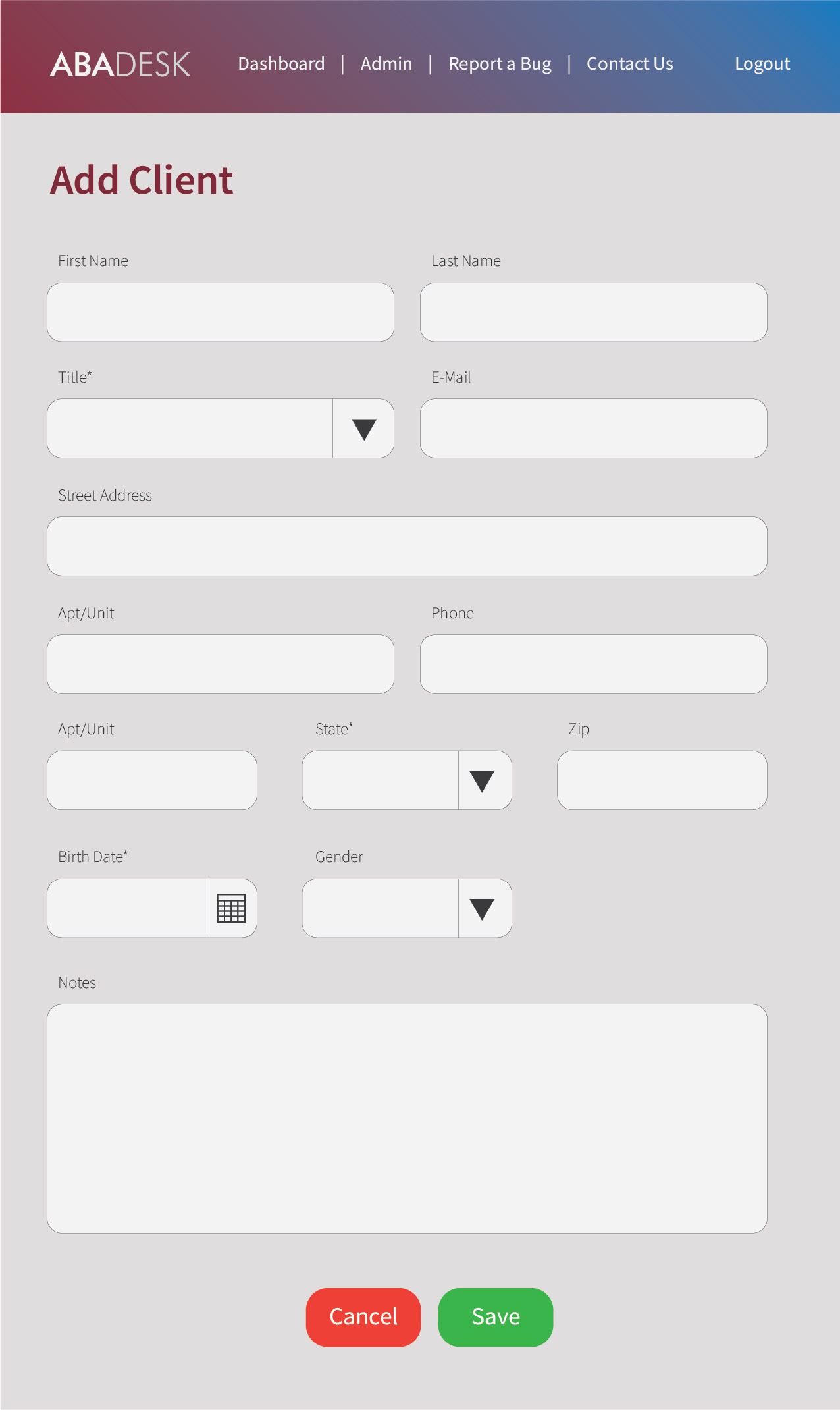
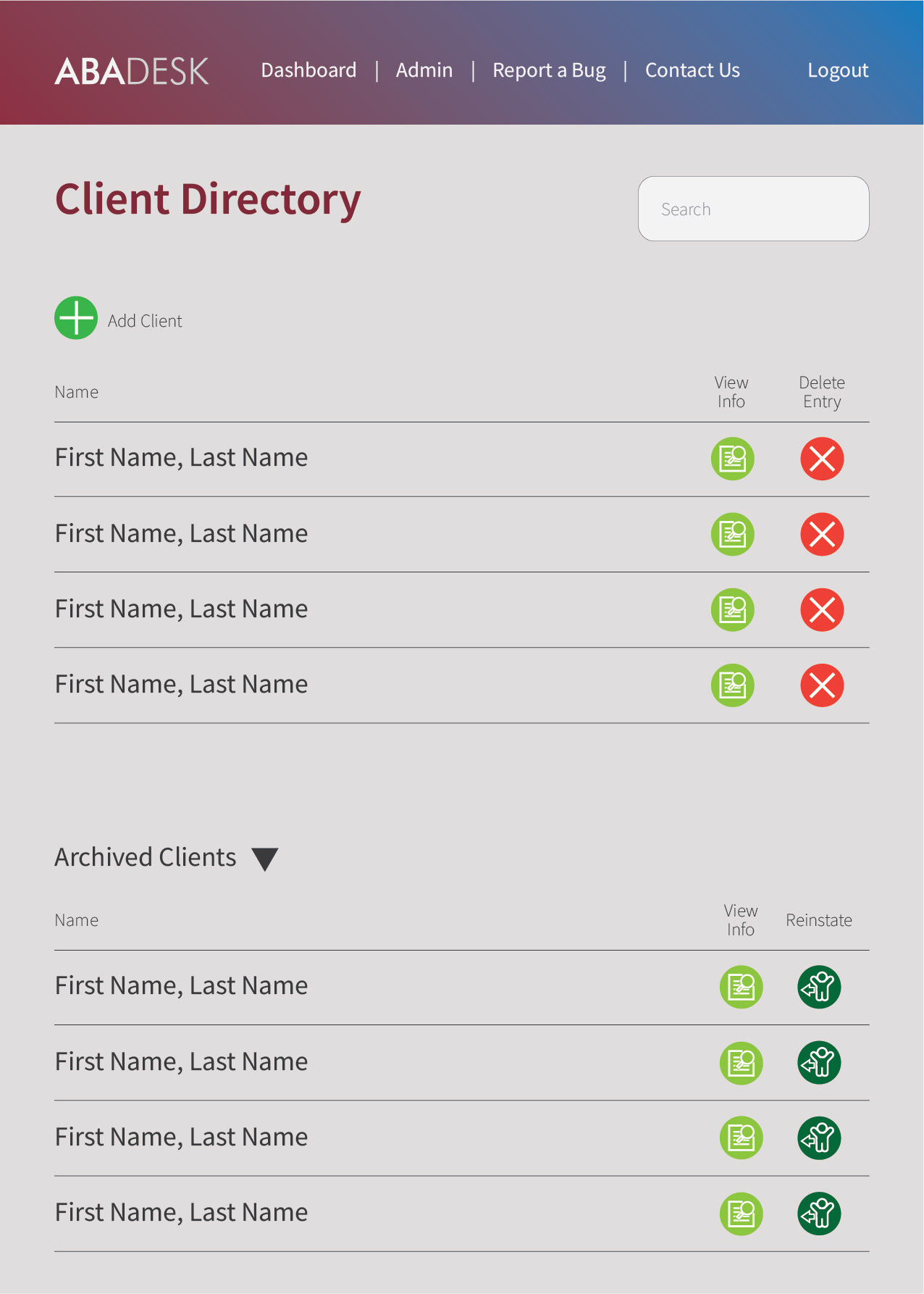
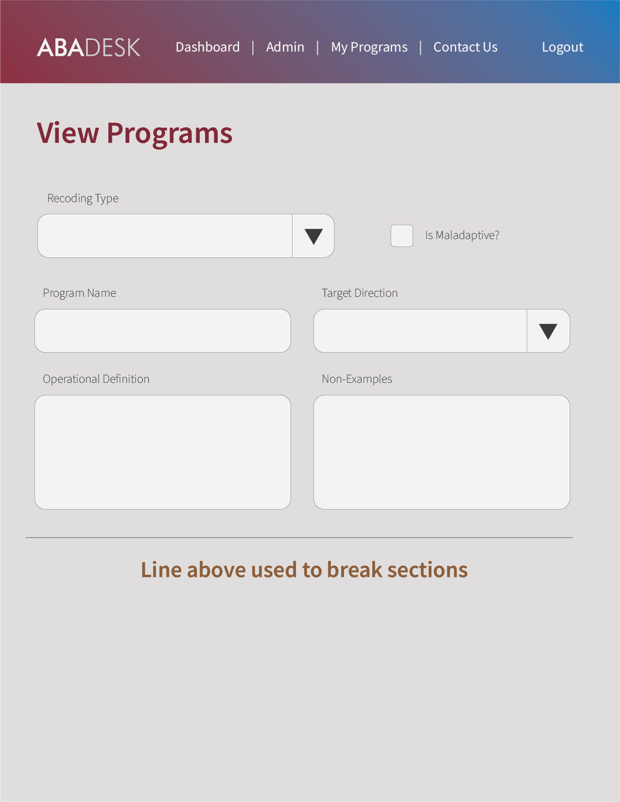
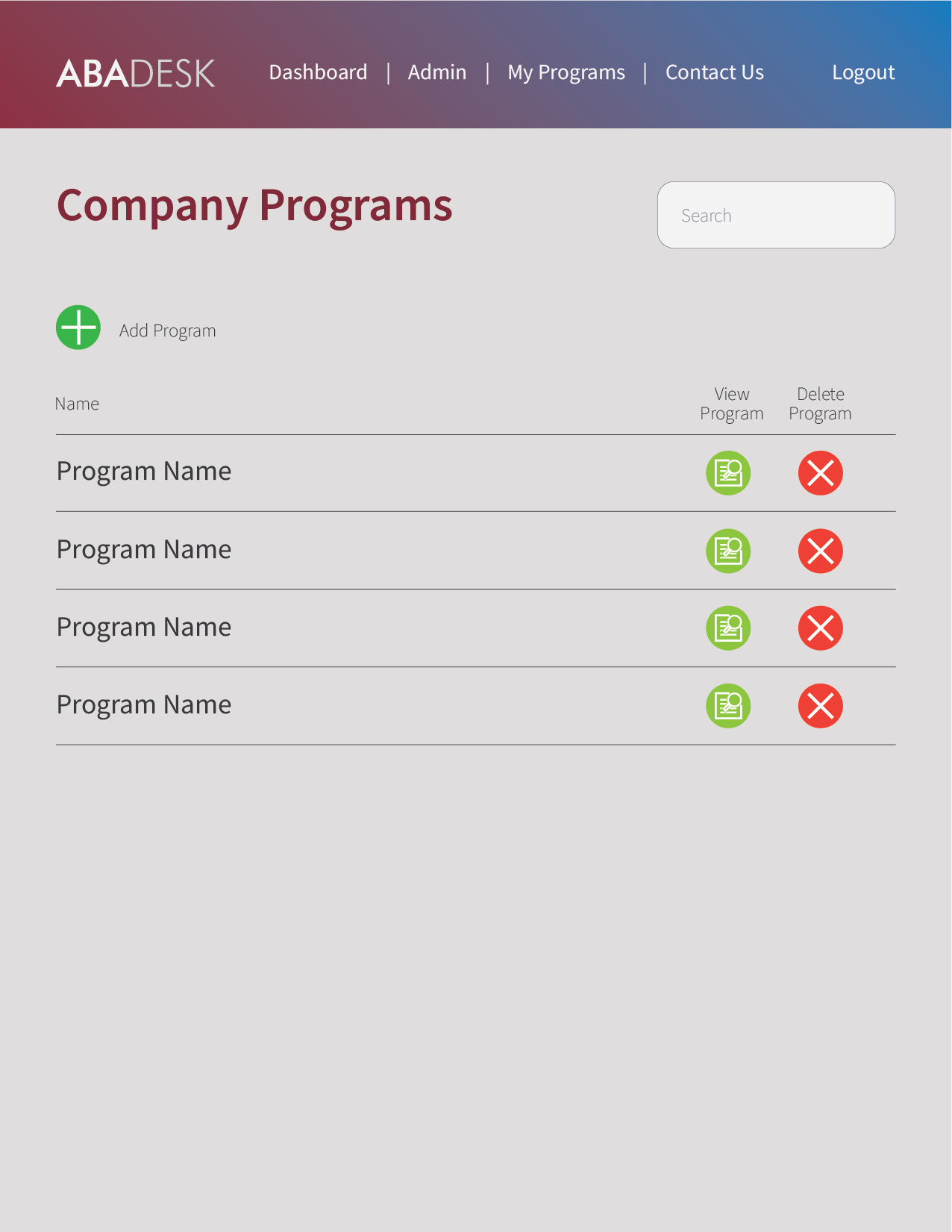
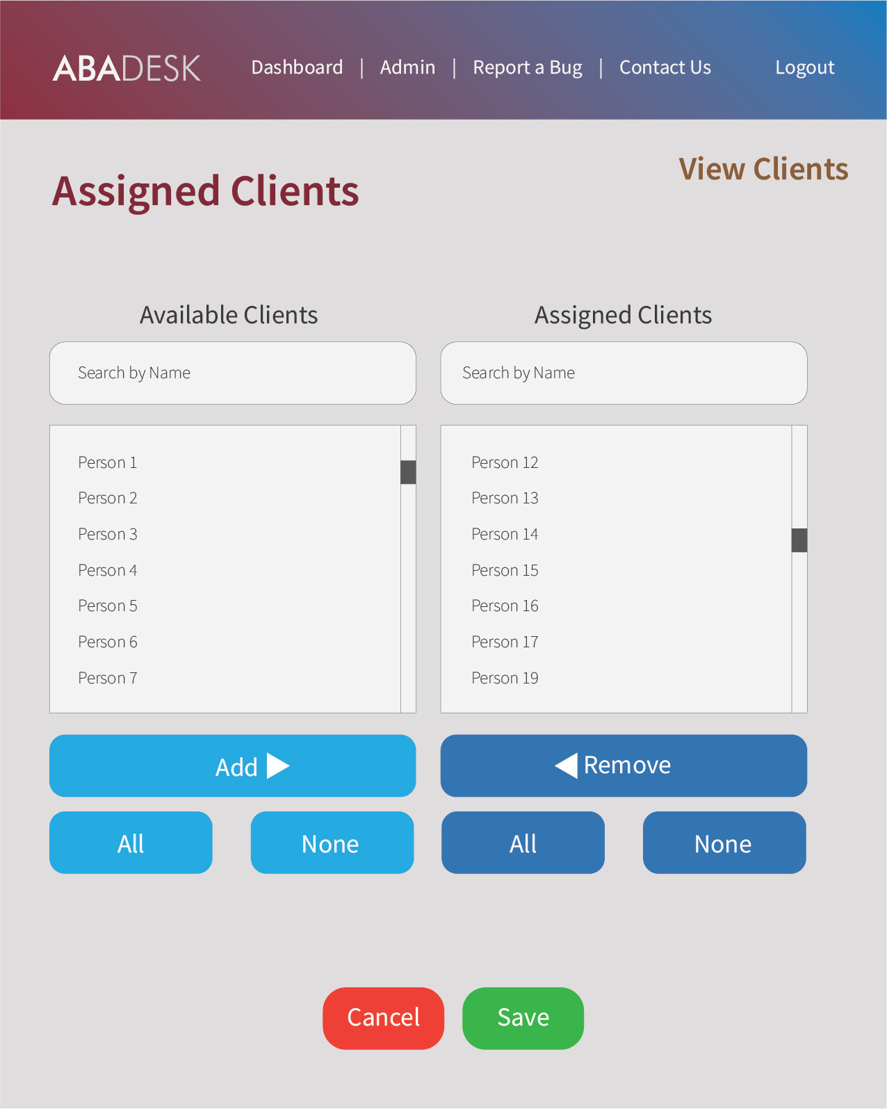
The biggest challenge was designing a layout that could benefit and accommodate the large pools on information that needed to be displayed on screen as well as the forms that would help fill in all that data.
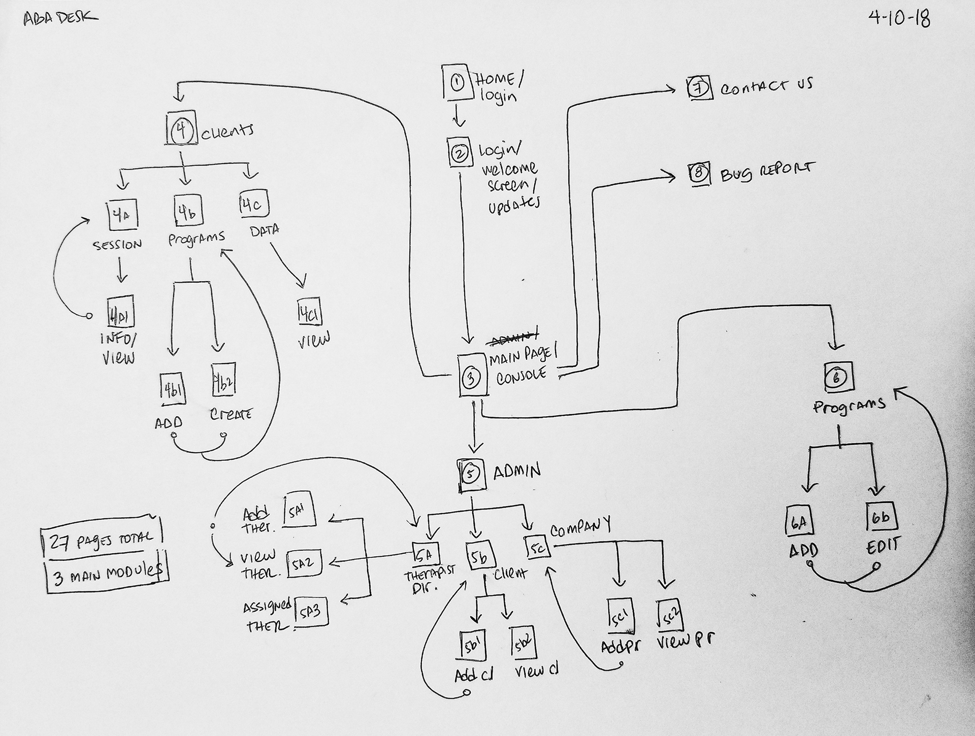
While analyzing the app, I had taken notice that the developers were working without a a visual framework to keep track of their progress and how to tackle each part of the project in order.
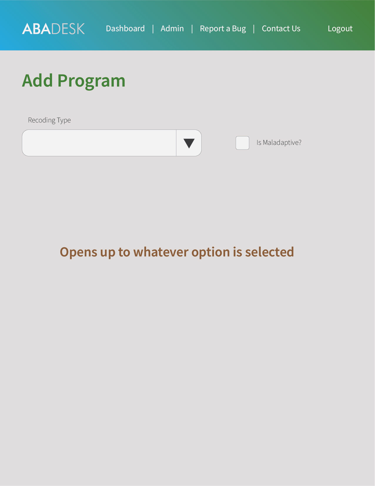
So the first thing I decided to do was to create a simple mock up of the entire website/application to create that frame of reference. This mean going over every page, field, and button, to understand what each element would do, and notably, where it would take the user.
After the initial sketch of the entire application, we were ready to start.
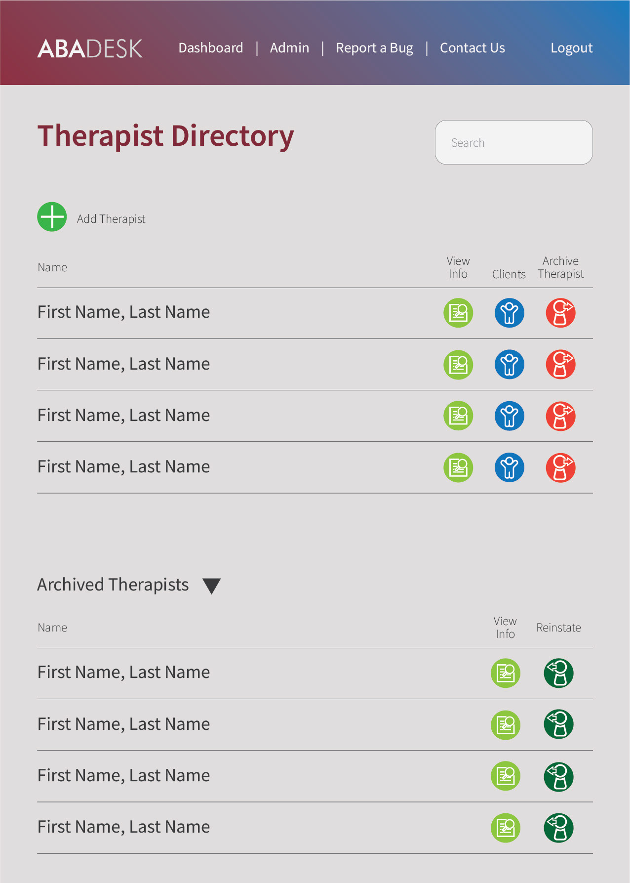
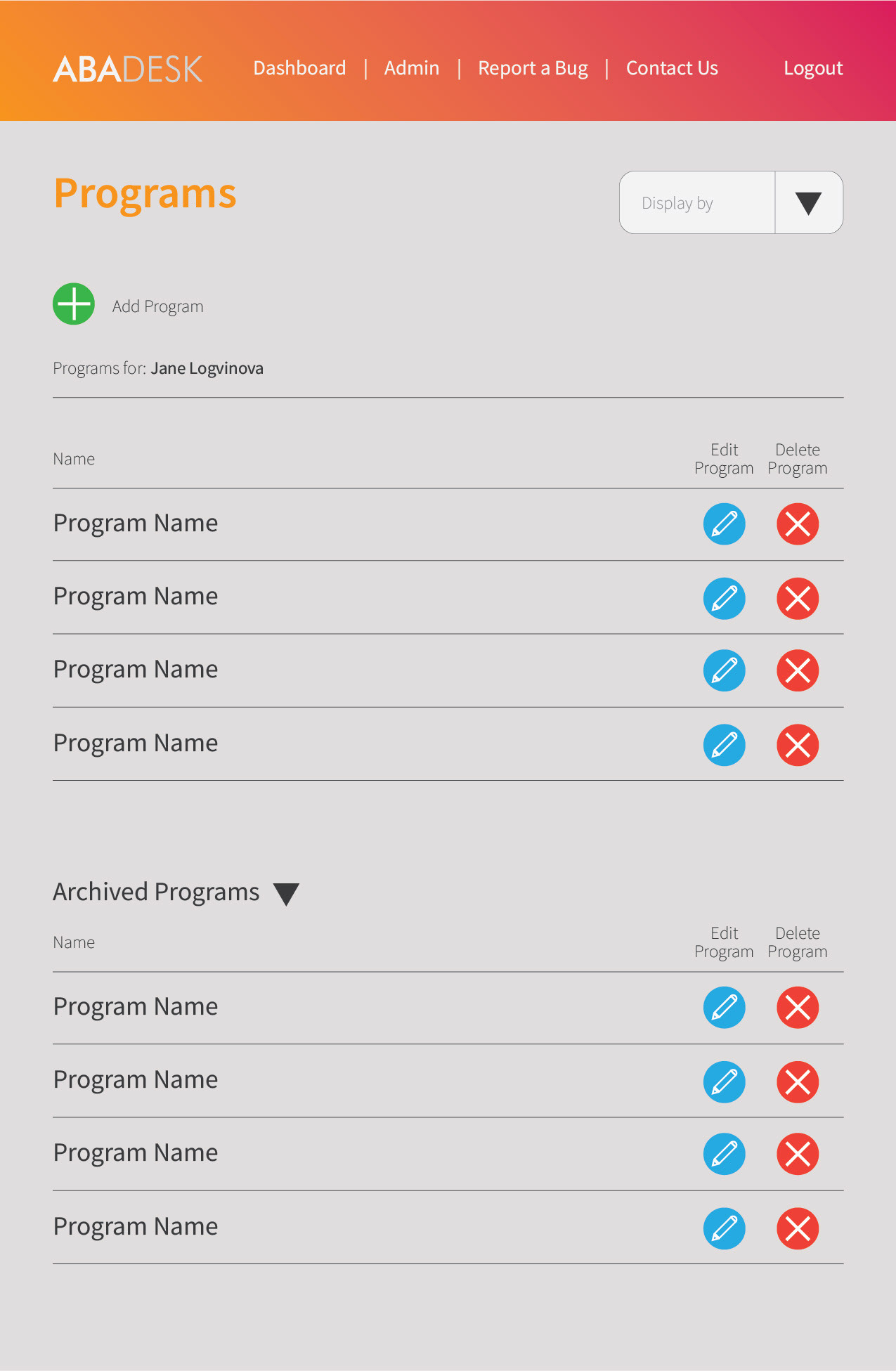
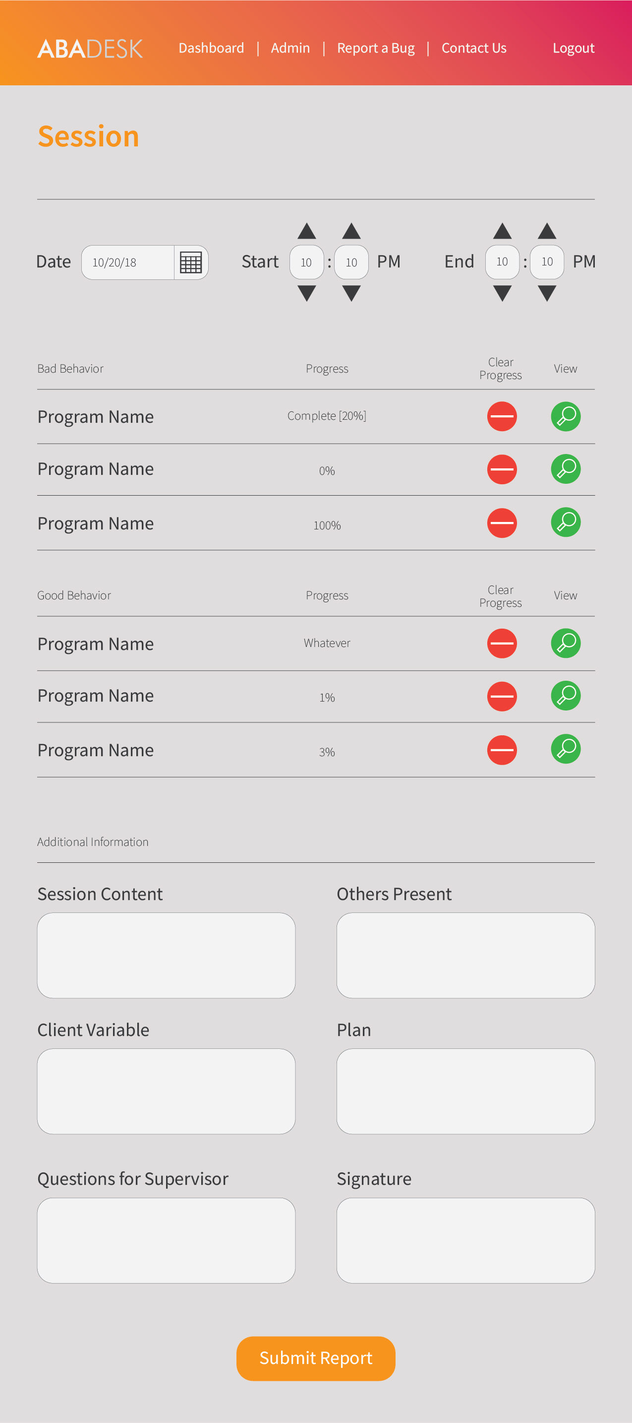
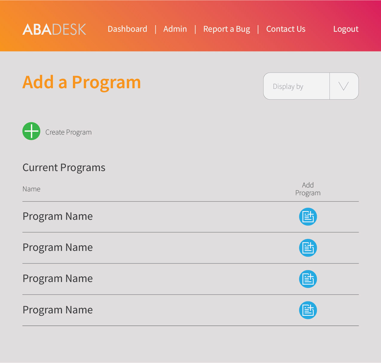
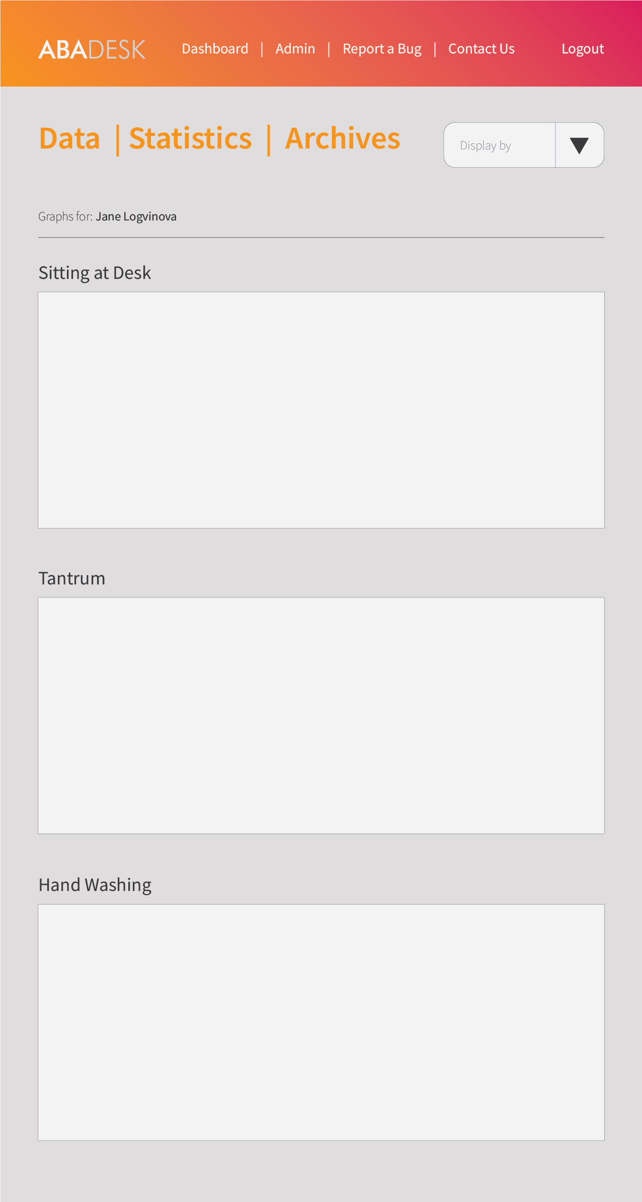
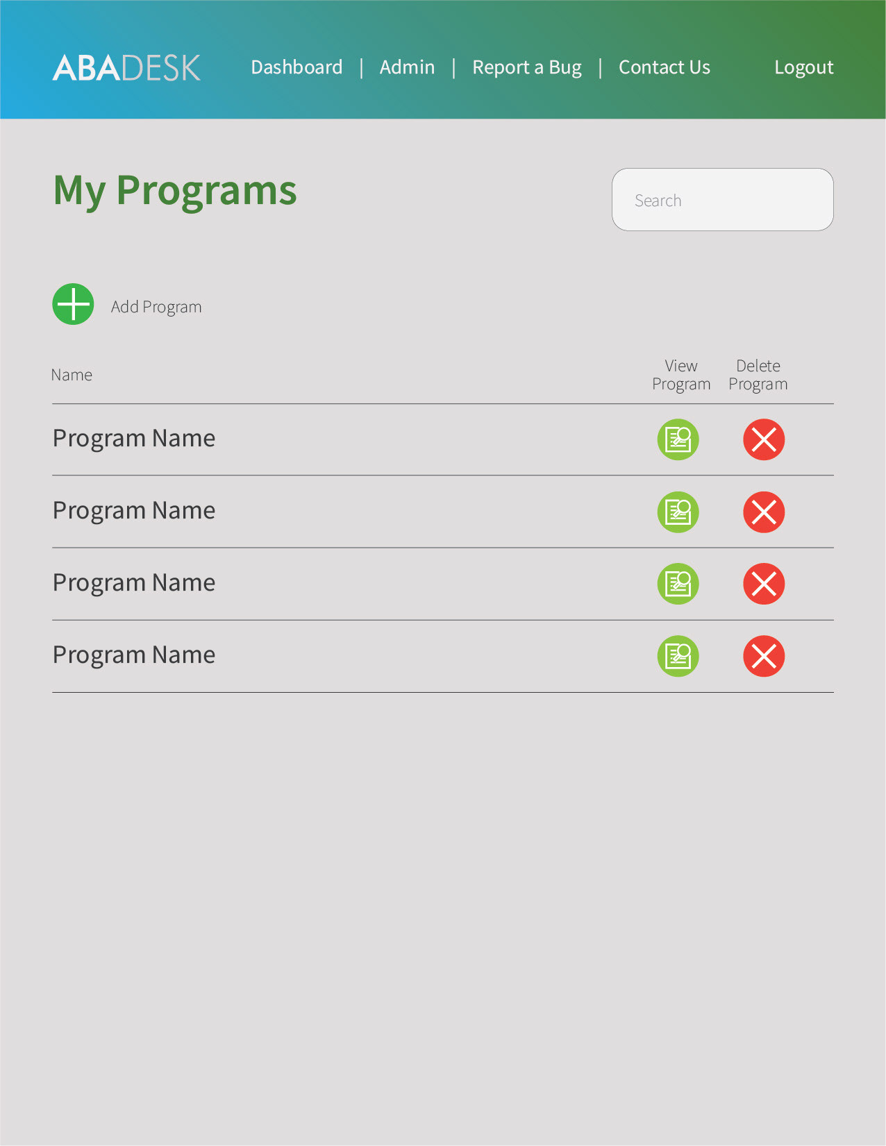
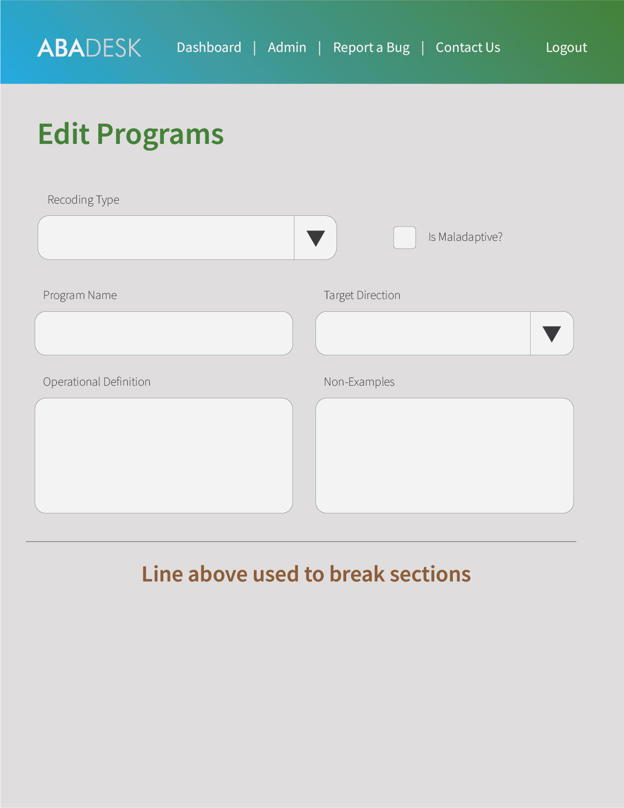
As the development team was able to organize itself with the application map, I took notice of how much information there would be on display on every screen. At that point I began focusing on the need to design something far more practical rather than just aesthetically pleasing.
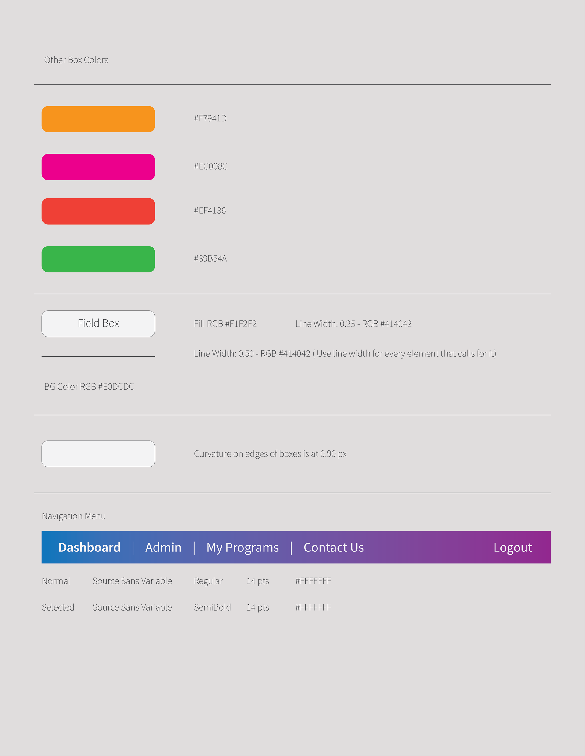
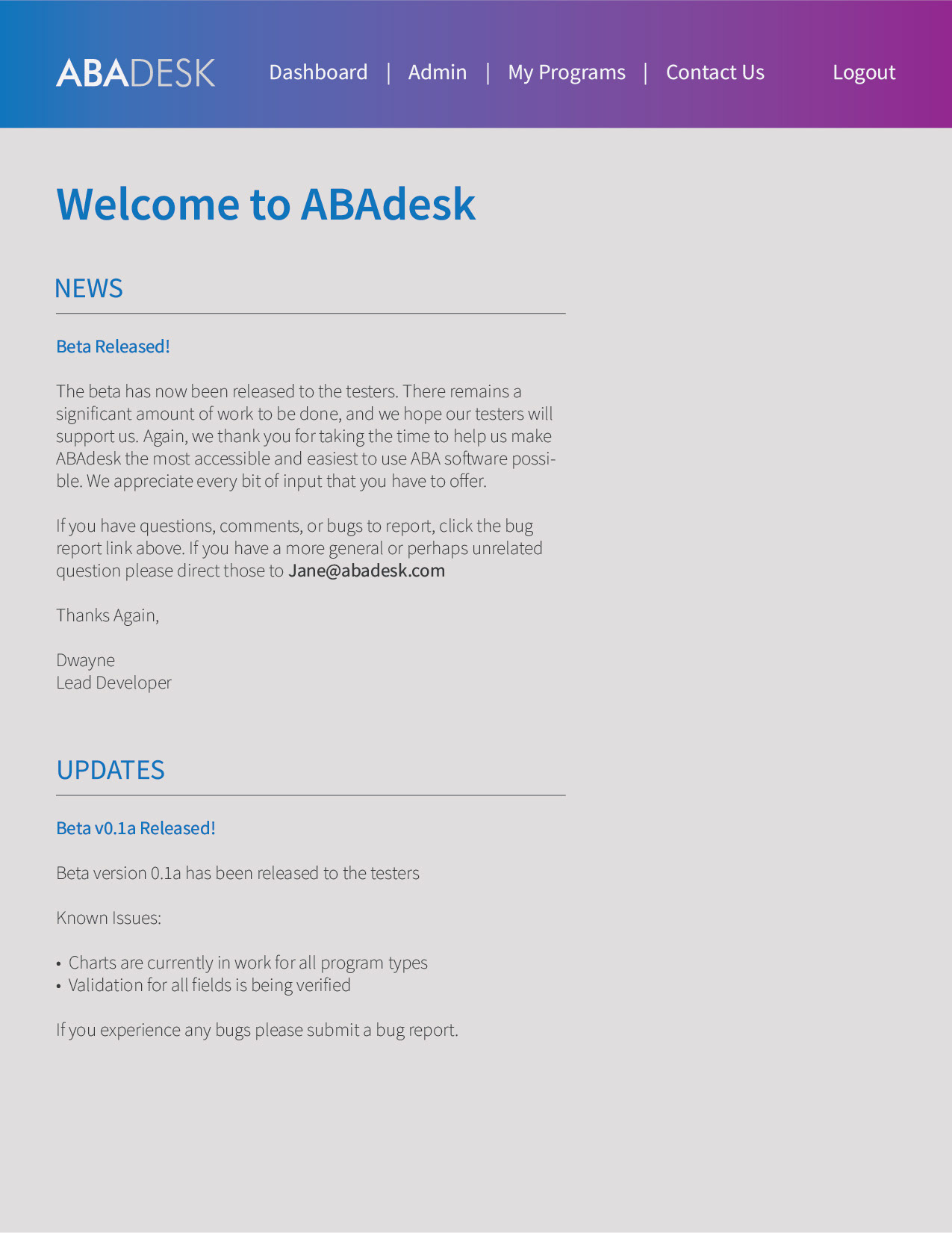
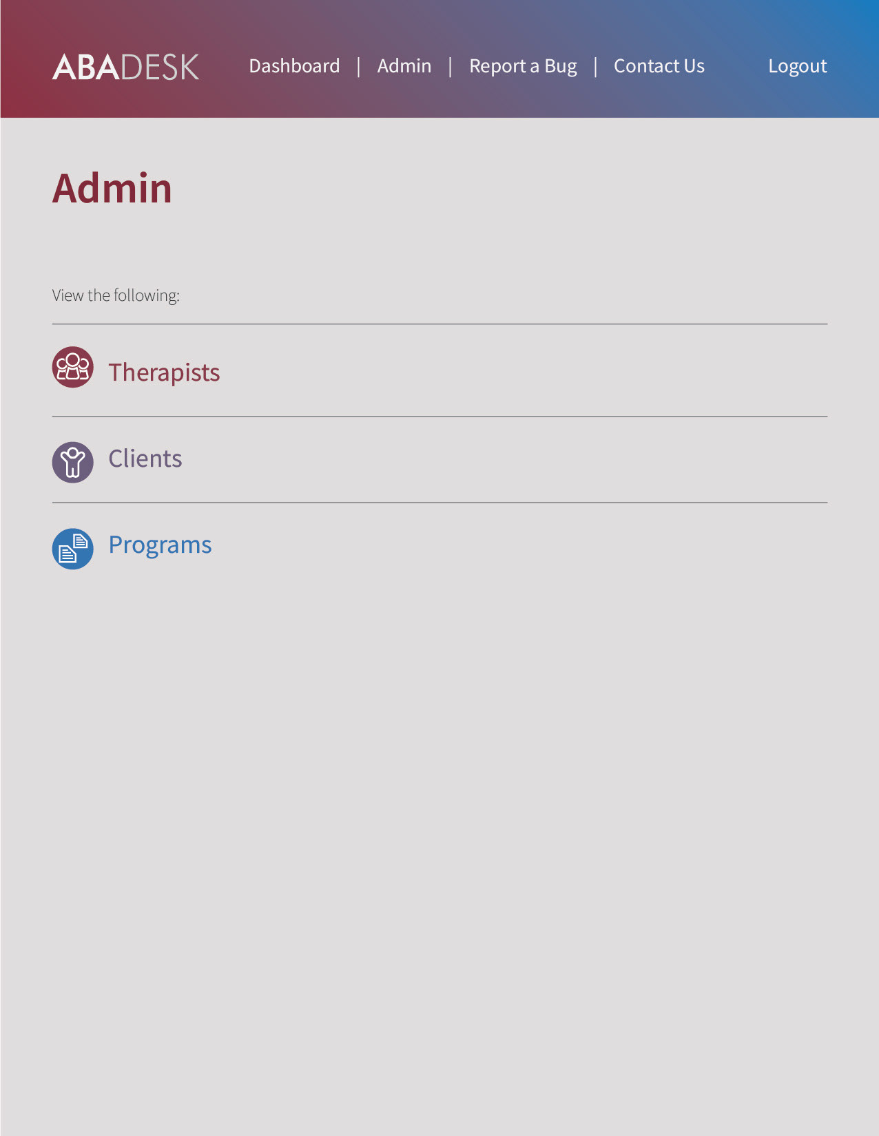
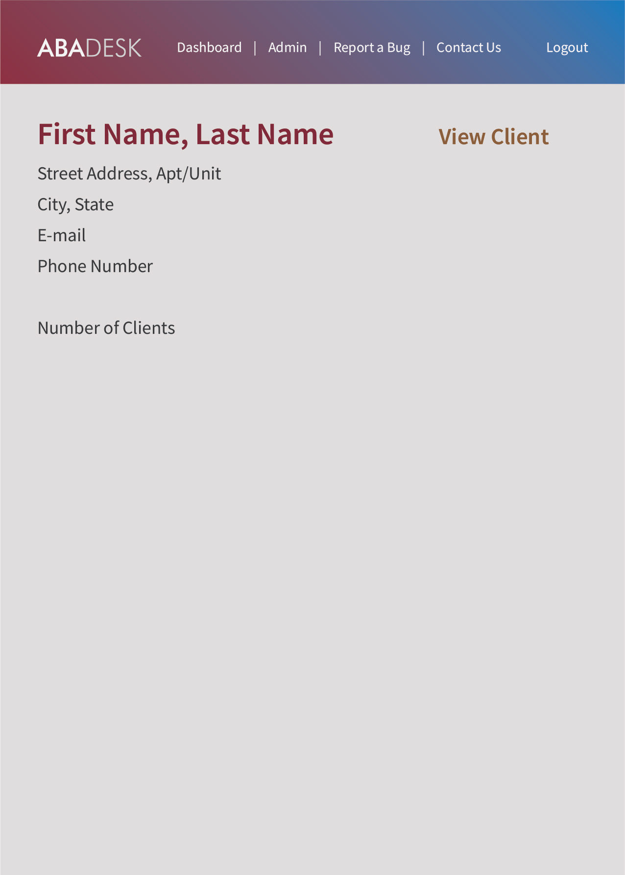
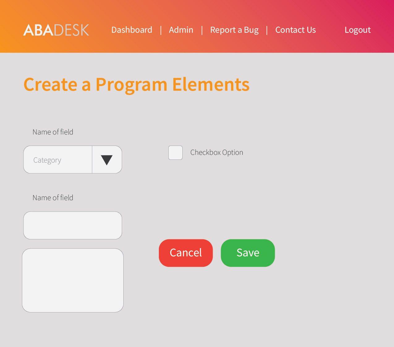
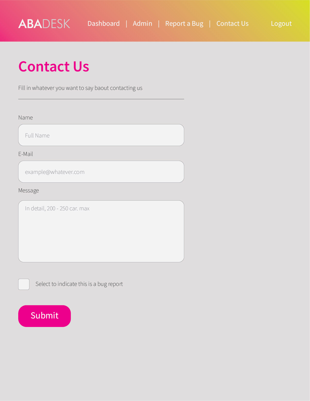
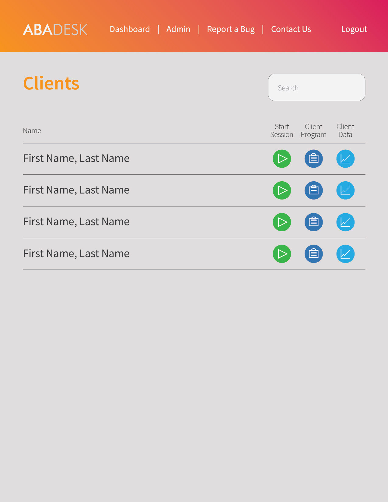
The amount of information being displayed per screen meant there needed to be elements that were easy to identify and read in order to help the user input the data needed and be able to look for it and read it back with little effort.
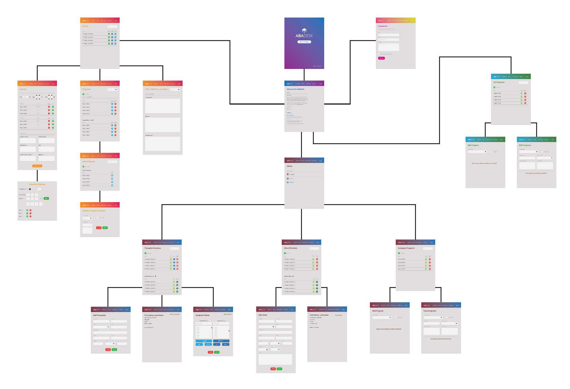
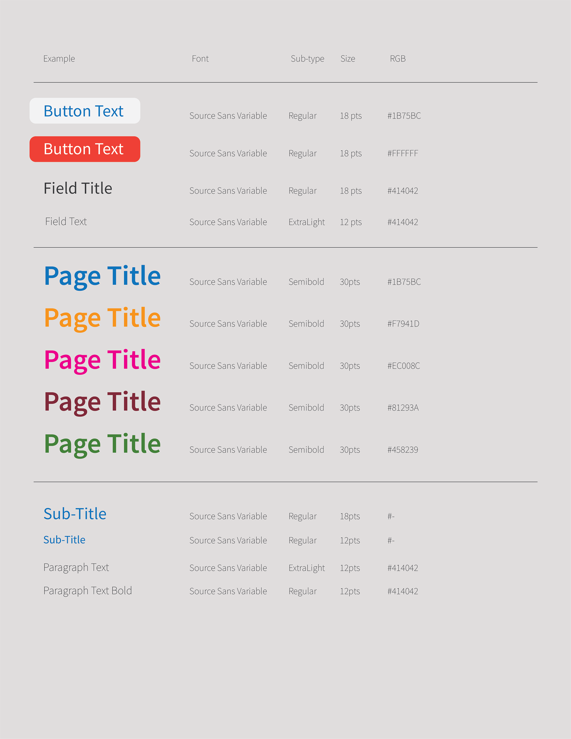
Since the application was mostly showcasing the pooled data from its entries, I figured out that by creating a specific type hierarchy would help give each section of text its proper placement on the overall layout.
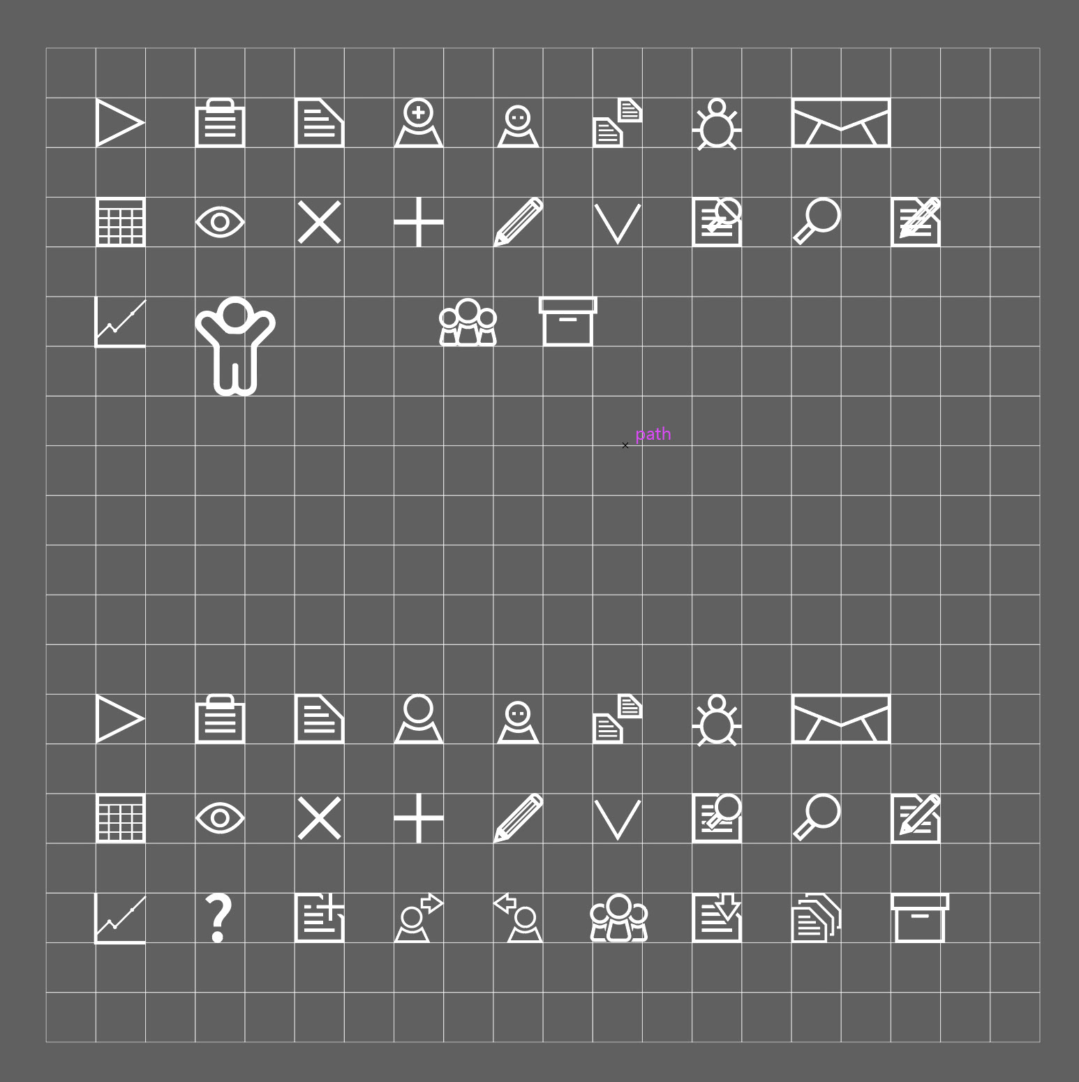
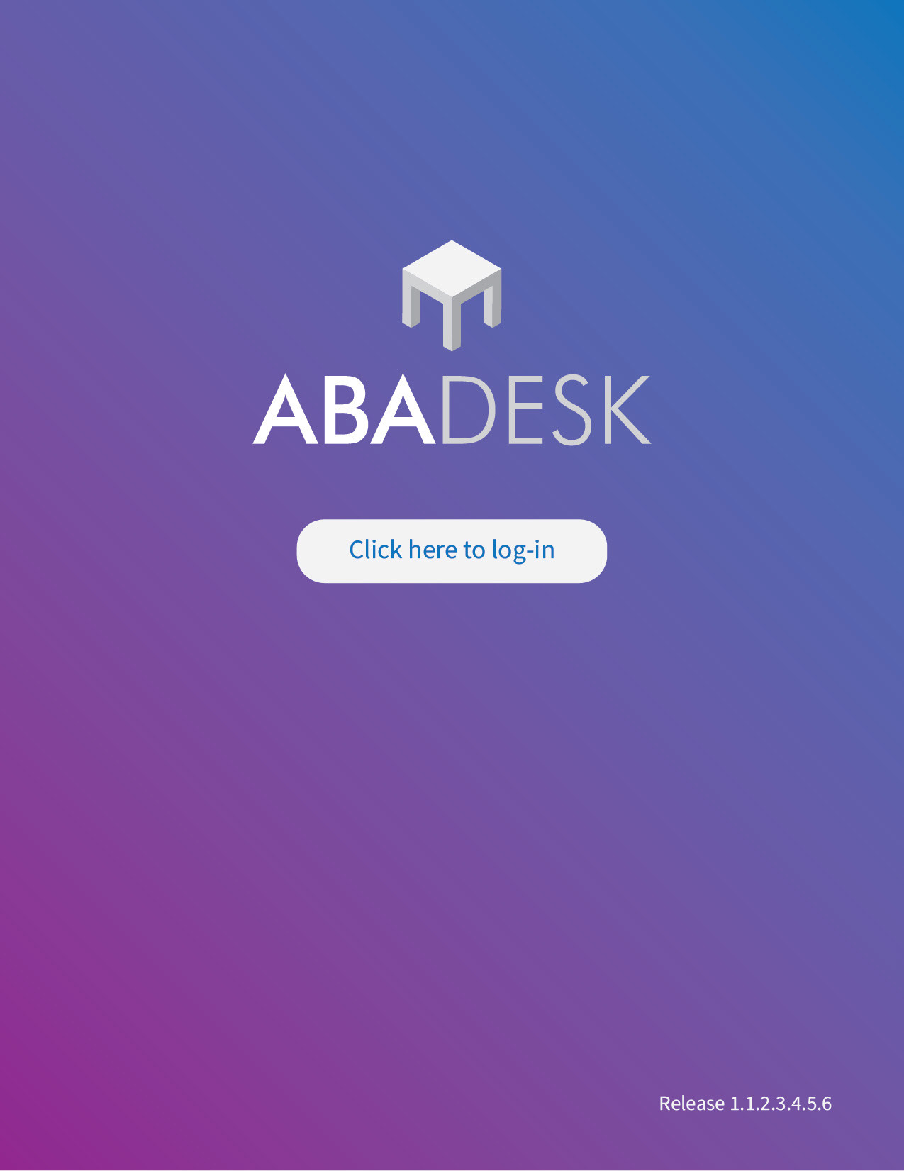
A small library of icons were then developed along with the logo to make sure heir brand was being correctly displayed and for any future needs that might arise for the dev team to use.
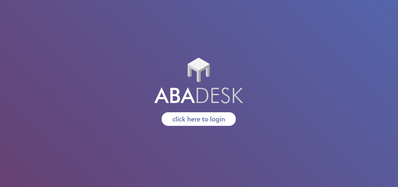
Some elements of color were included to make sure the user was aware of what section they were using since the program was basically more of a database with many components. Also since the user would be operating the app through their personal tablet or laptop, the background was changed from pure white to a warm gray as to not tire the user's sight.
By the end of the project, the screens had been developed and the development team knew what they were aiming towards.
As an added bonus they were able to create videos earlier than expected to publish online and help their marketing efforts.