Sadler-Bridges Wellness Group is a practice rooted in mental health, that desires to serve the community by providing client centered care with goals to grow into a holistic wellness group that would incorporate other wellness services extending past mental health and into healthy living as well.
Committed to transparency, integrity, empathy, and kindness, they look to provide top tier wellness services to communities in upscale areas while being accessible, warm, and inviting.
For the brand launch, they needed a look that could provide a glimpse into the wide breath or their current and future specialities in order to compete with other mid-size private group mental health practices.
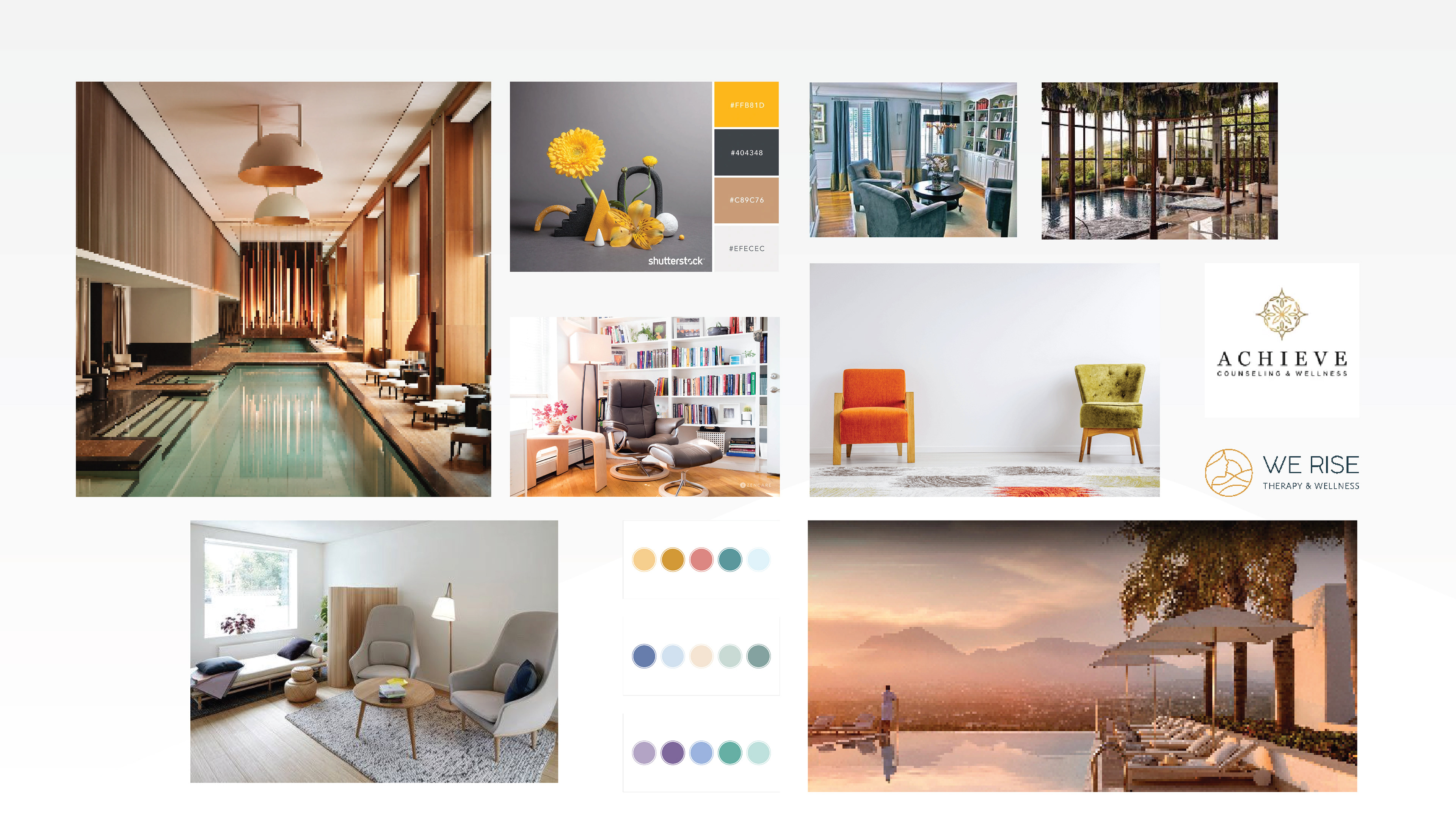
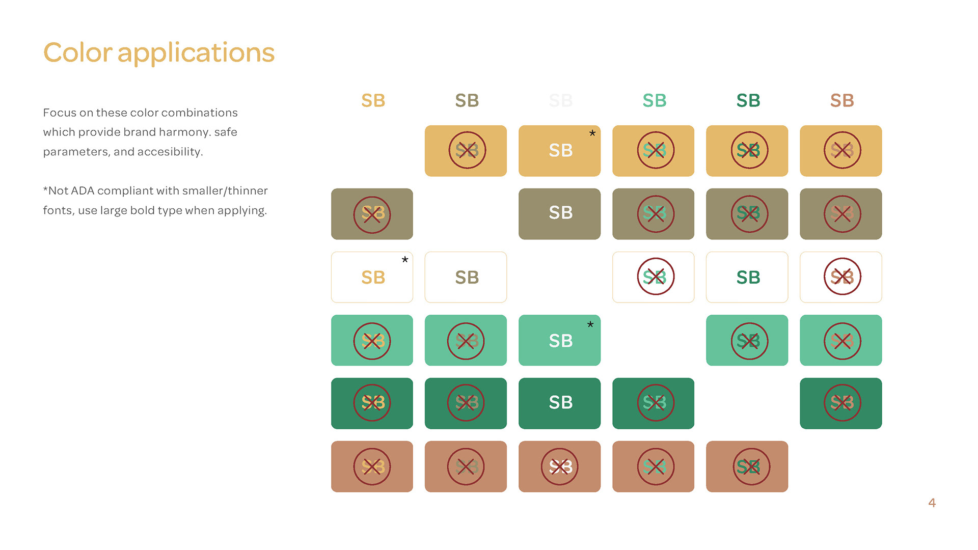
Research begun by framing the key categories of wellness, upscale, and growth together. Elements and colors were explored that were tied to the earth, symbolizing balance, growth, harmony, and health while adding a touch of elegance by introducing accents and a delicate weight to each component.
Research begun by framing the key categories of wellness, upscale, and growth together. Elements and colors were explored that were tied to the earth, symbolizing balance, growth, harmony, and health while adding a touch of elegance by introducing accents and a delicate weight to each component.
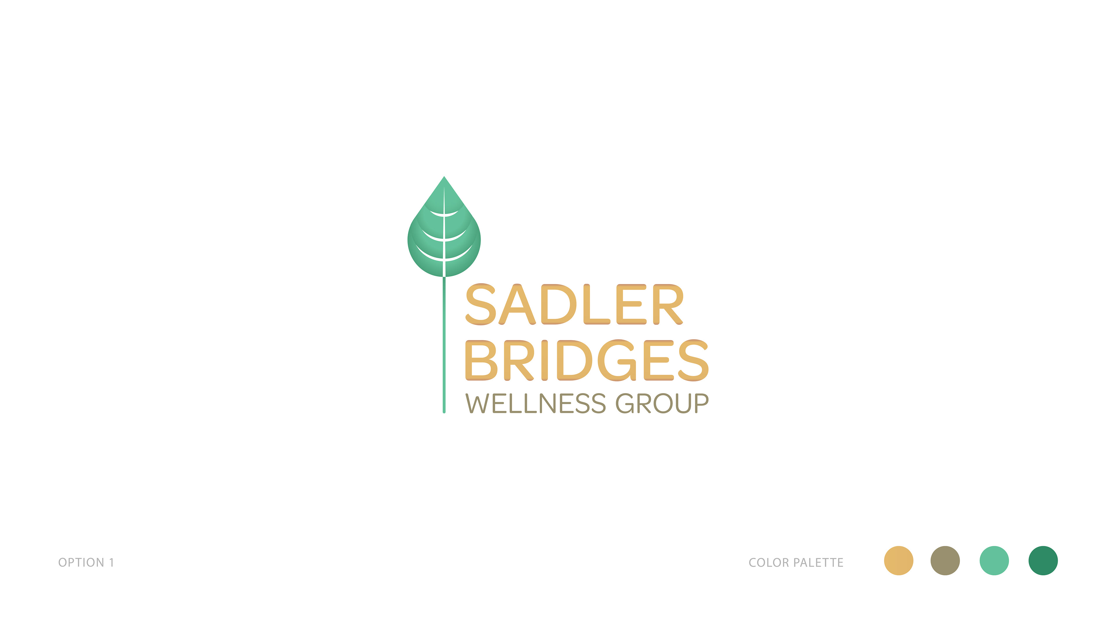
By the first round, six options were provided, focusing on how to convey the sense of structure and status with the subtle contrasts needed. Growth became the defining theme across the different options, while relating it to the concepts of calmness, and vitality.
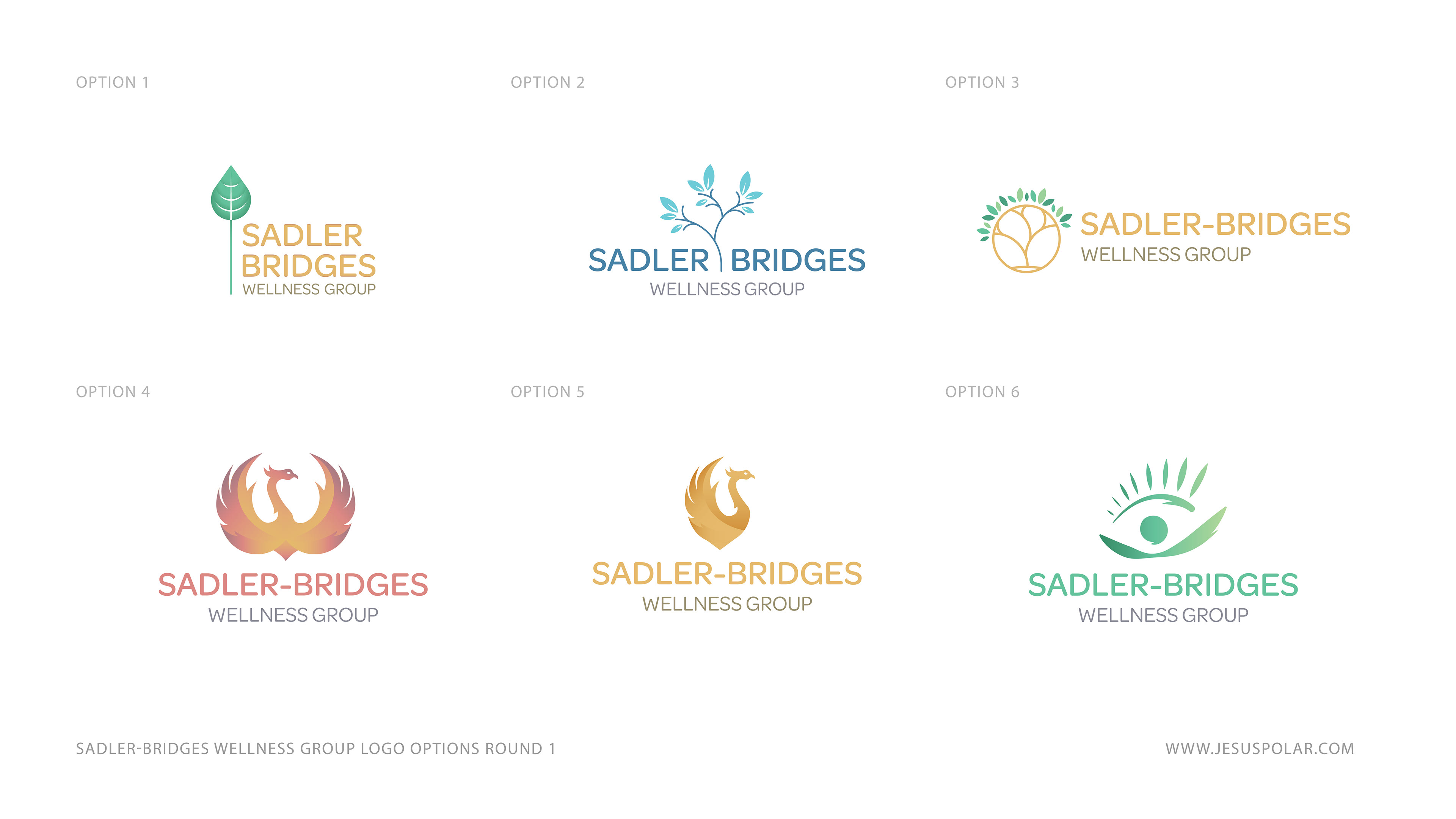
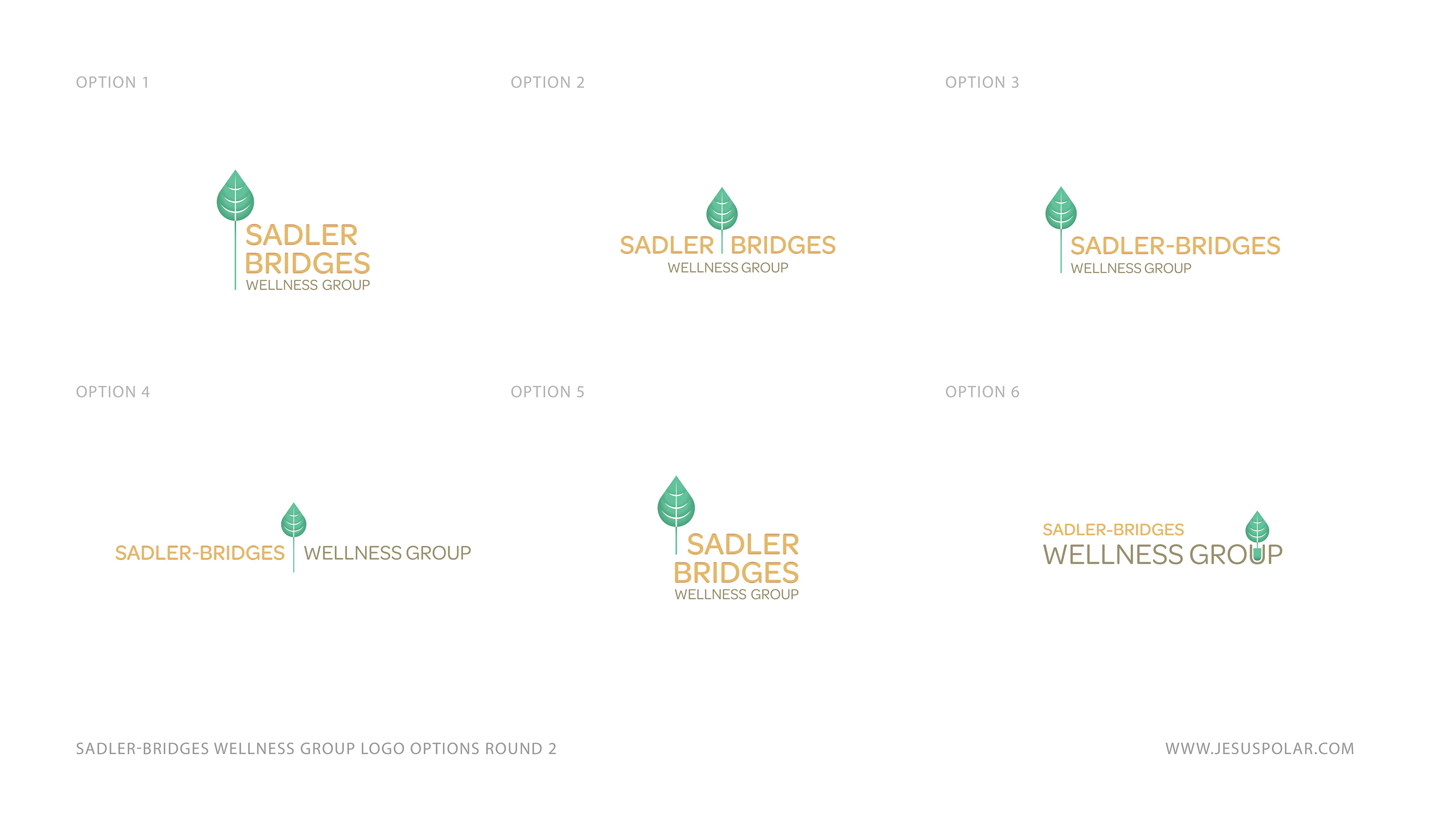
The client gravitated towards the first choice almost immediately, at they felt it best represented their values and mission while maintaining the accessibility they were looking for. While further variations were provided, the client was happy with the original version.
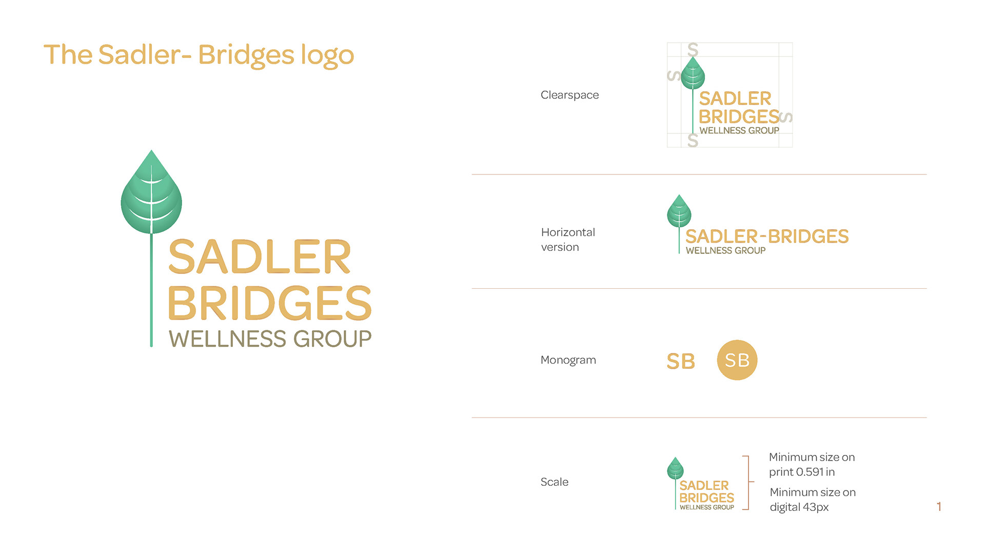
The creation of their visual brand identity soon followed, touching on the basic elements needed so their practice could start sharing their stories online and have the building blocks to explore the future of their business.

Ultimately the brand while condensed, was a good fit for their start-up practice and