The team had the basic resources, a logo, a mission statement, and most importantly a culture growing from that mission. That gave me a wonderful opportunity to understand what made the brand work and in turn give me the necessary research to develop their brand.
It all begun with questions designed to breakdown their views of the company and how they identified with it, primarily: What do you think Gamelevate means to you? This was asked not just from the executive team but from their editors and writers as well. There was a surprising overlap from what a freelance thought the company stood for and their founder.
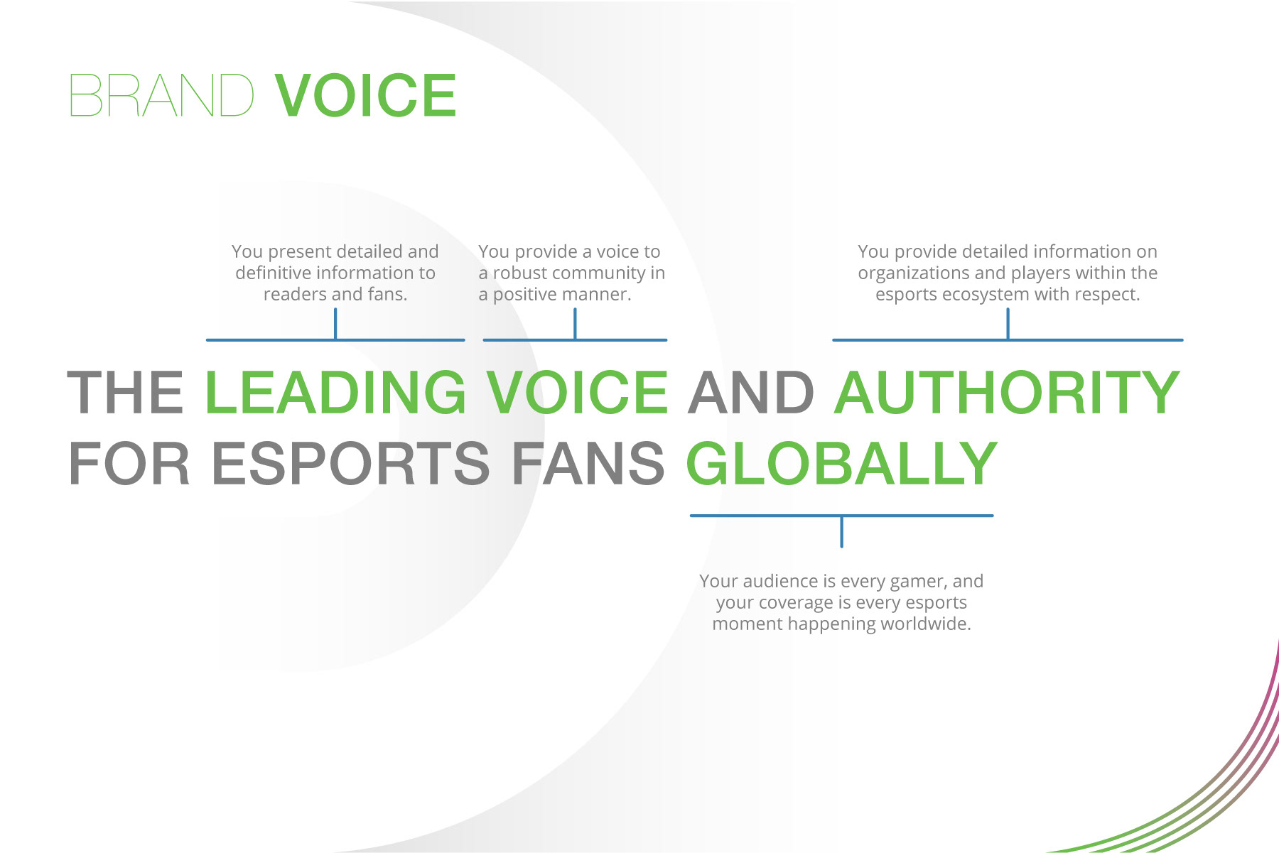
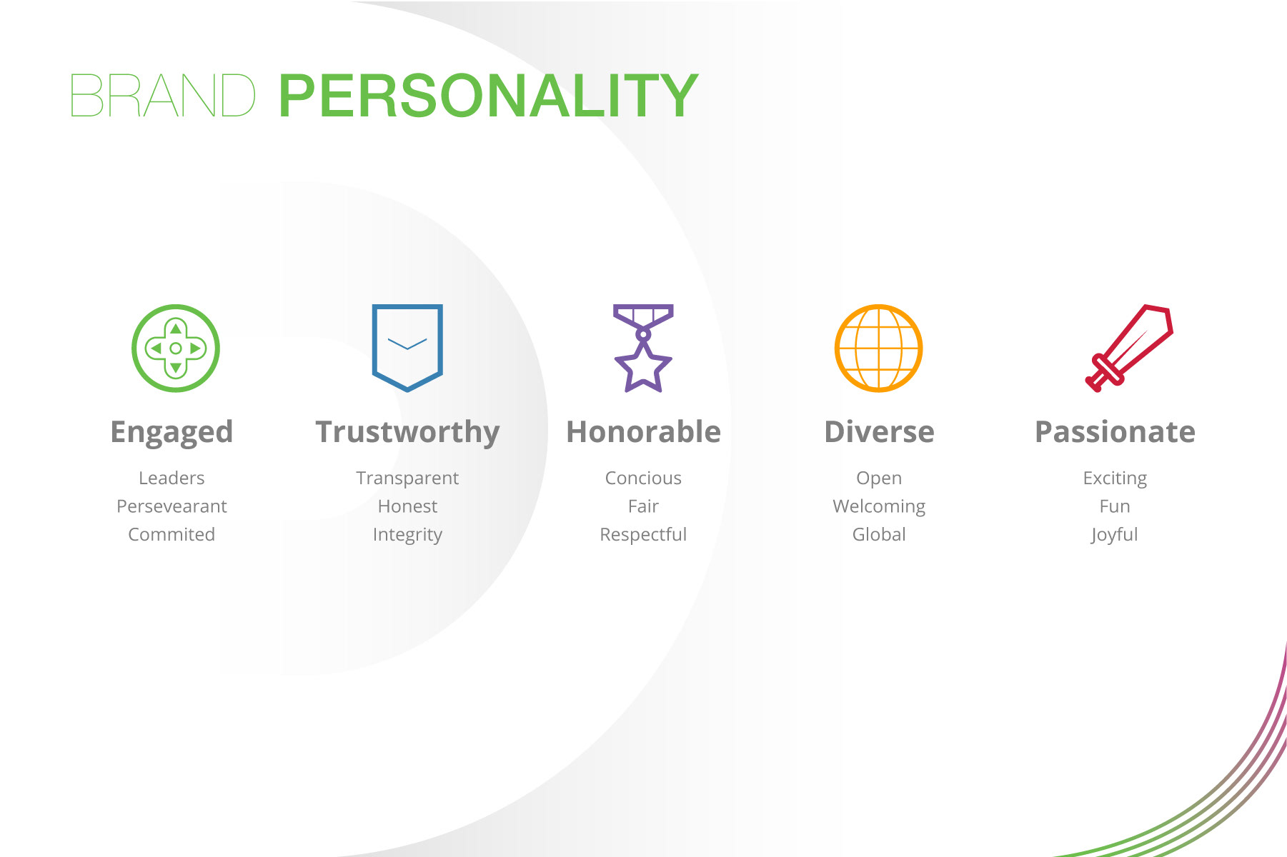
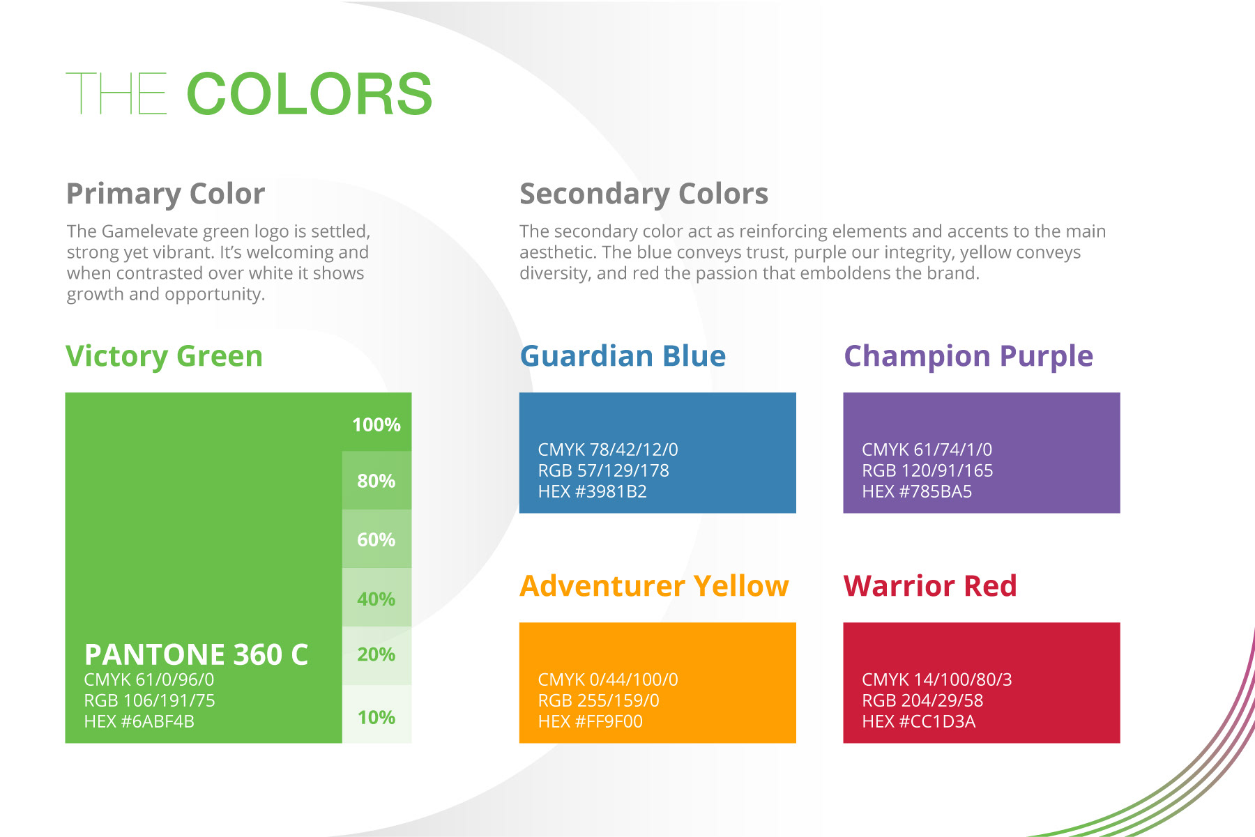
Taking that information, I set up what became the core pillars and what would be the personality of the brand: Engage, Trustworthy, Honorable, Diverse, and Passionate. These keywords represented the shared values of the team and their expression.
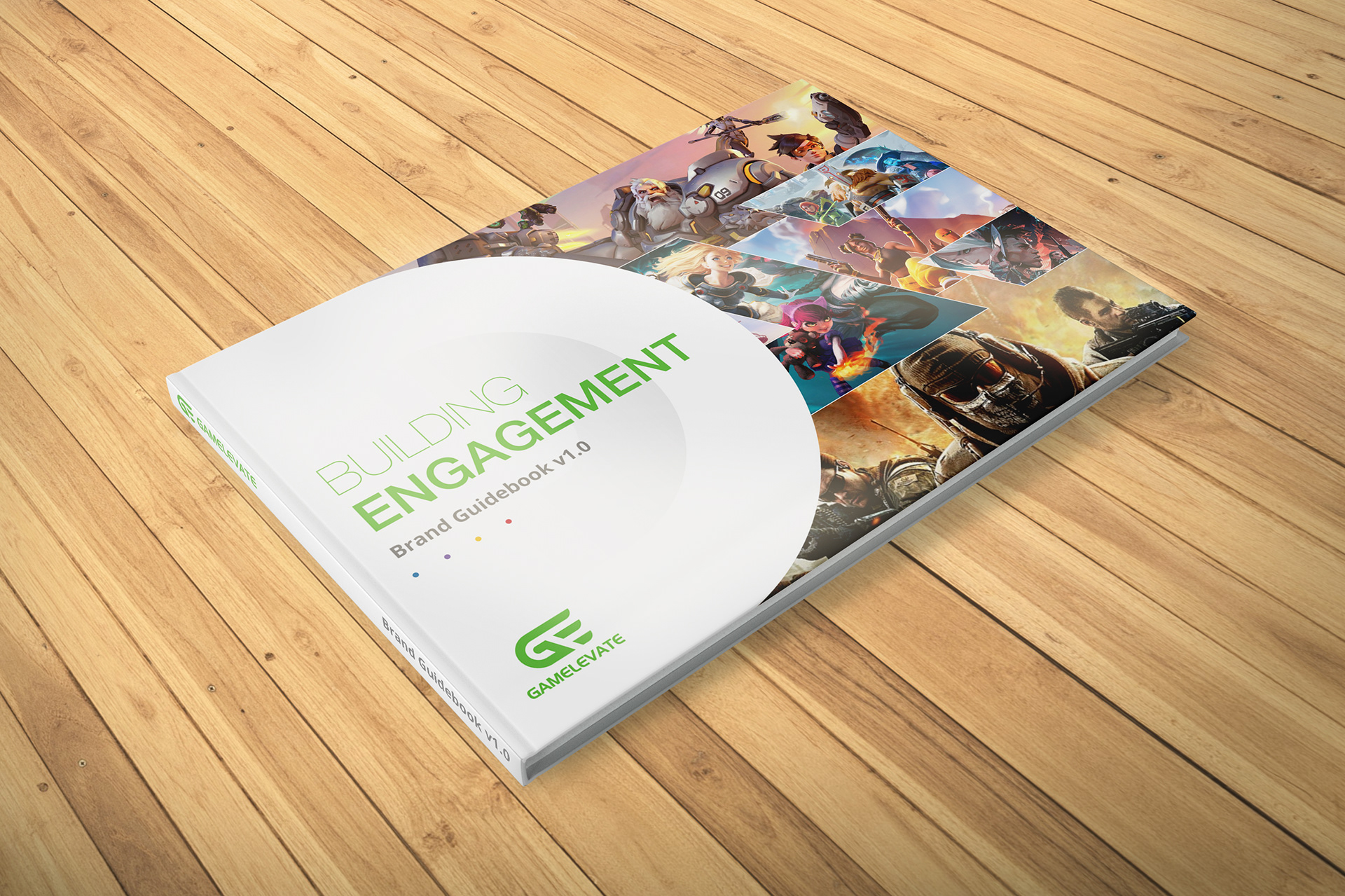
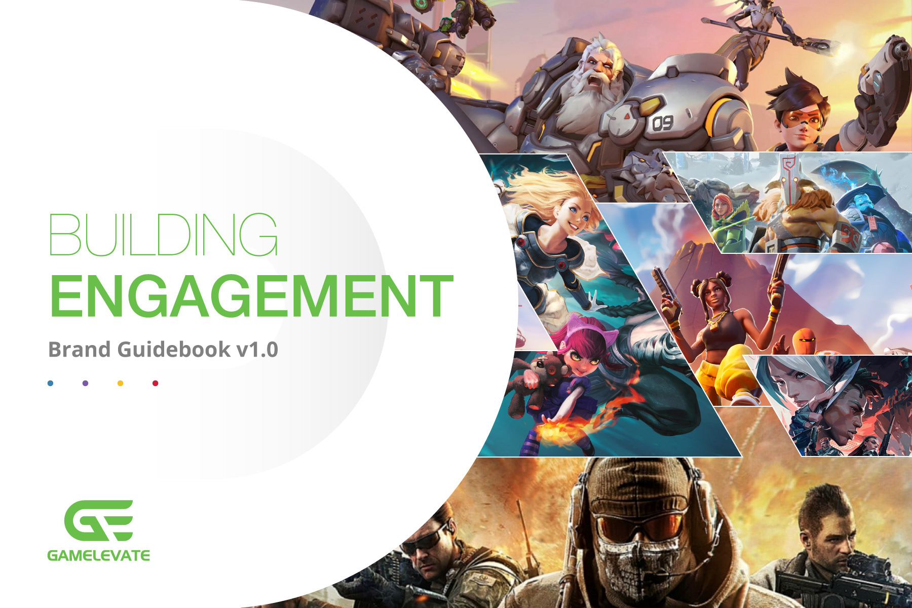
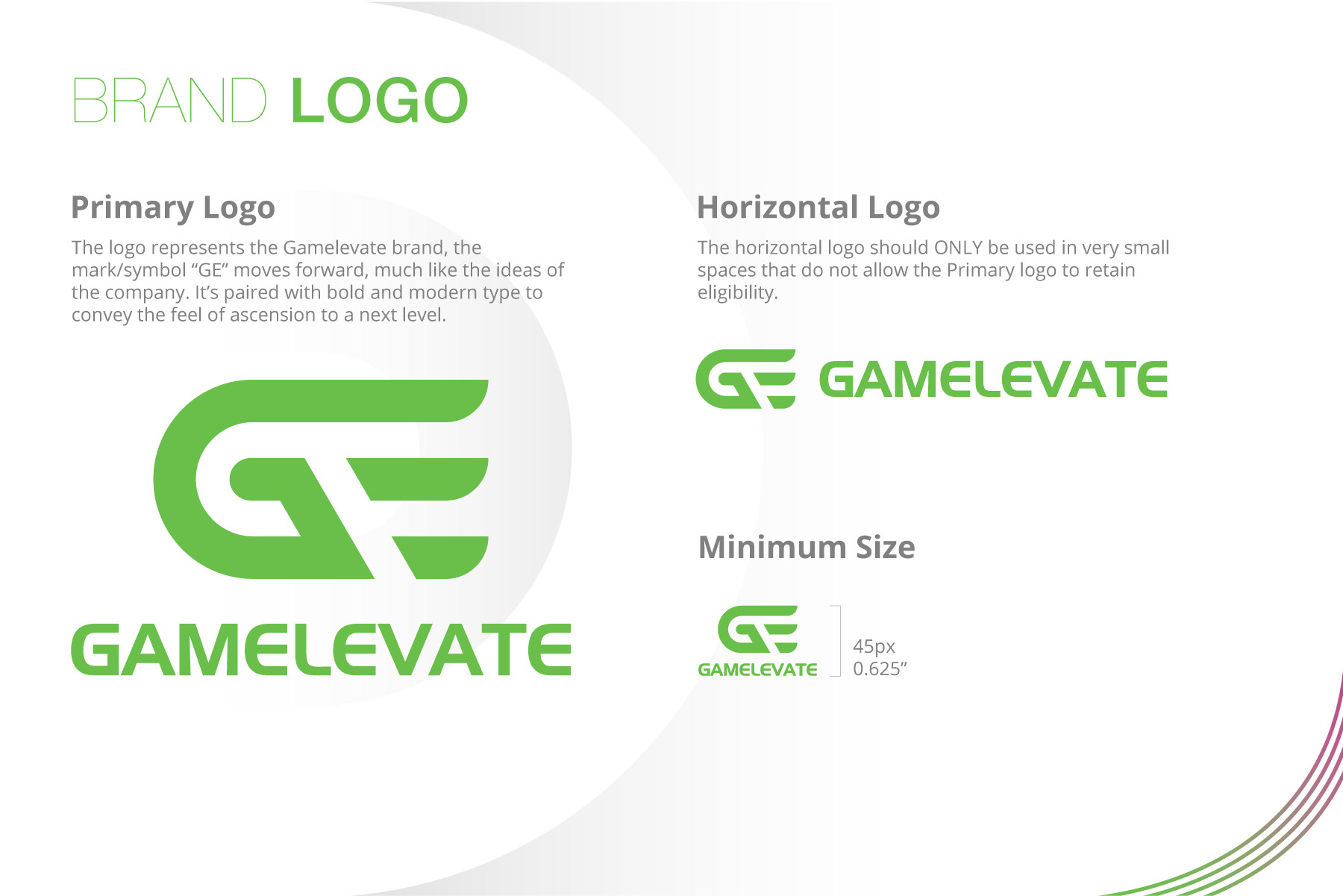
The logo had already been established prior to me joining, but they were open to redesigning it and changing the original colors of green and black. Since I had already established engagement it felt appropriate to keep the green with some adjustments to make it more grounded. But the black backdrop was discarded for something more clean and pure, the white and light gradient tones could support what the company had been wanting to establish, a place where people could discuss topics in a respectful manner while at the same time giving the brand an elevated look.
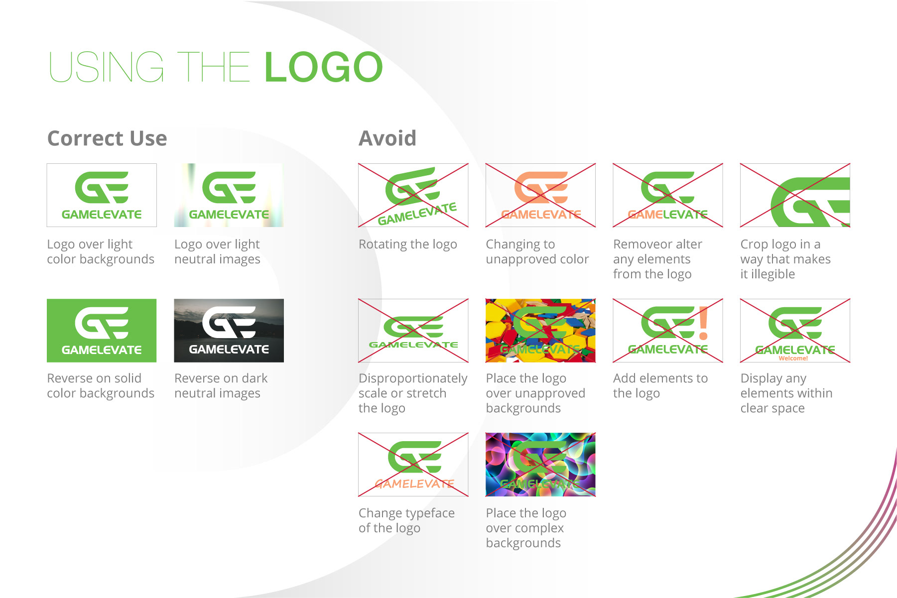
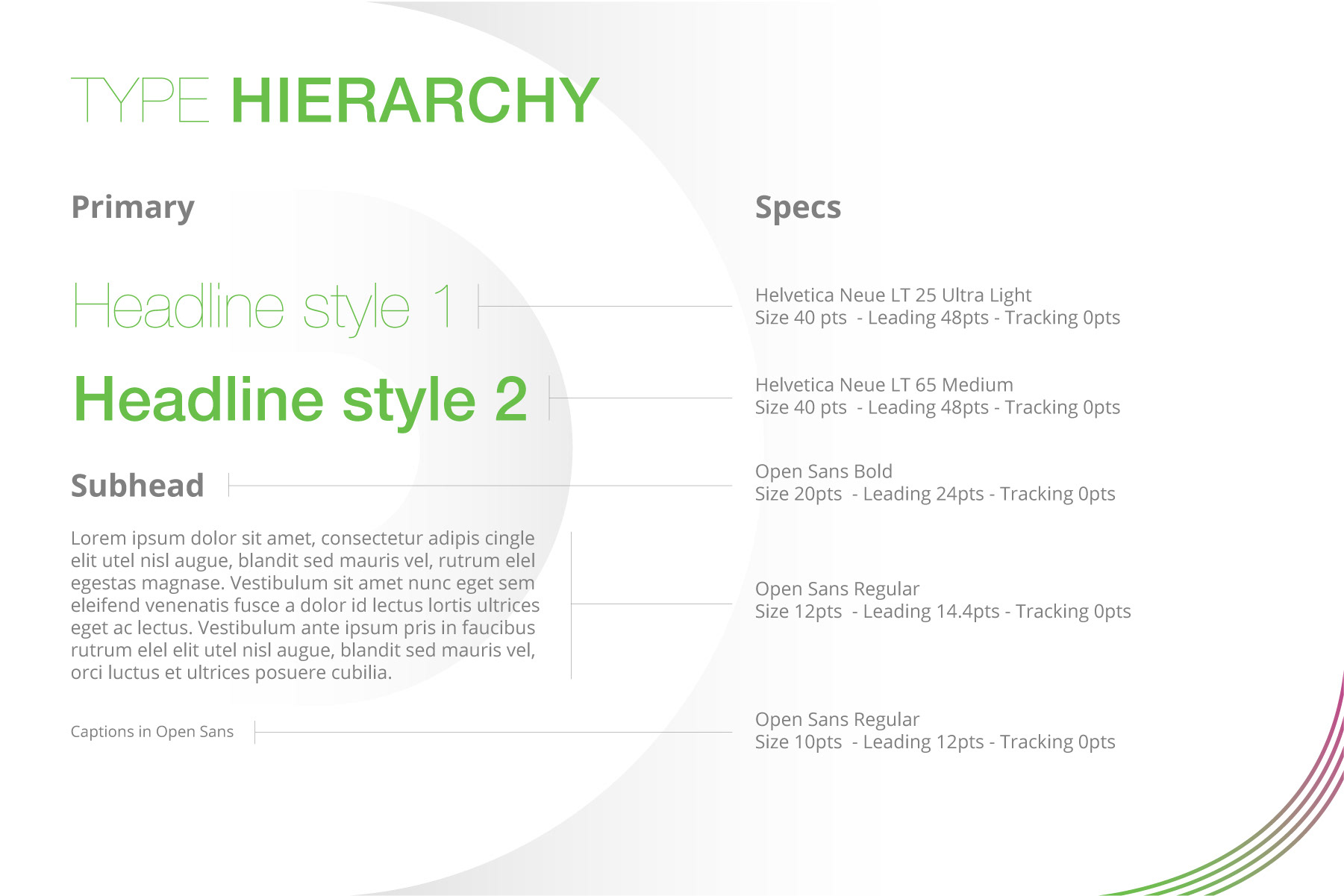
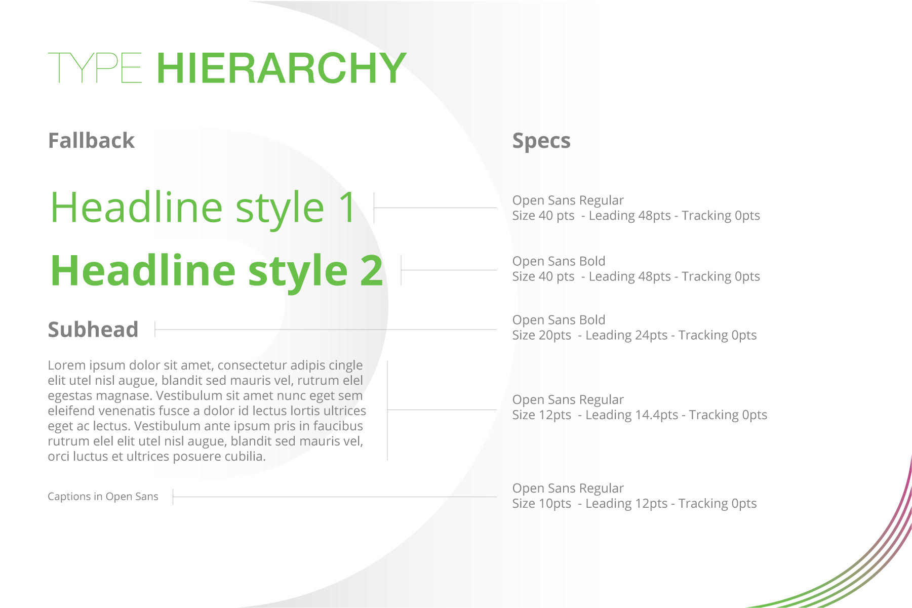
The visual guidelines needed to be thorough considering they would be presented to investors and ad space buyers.
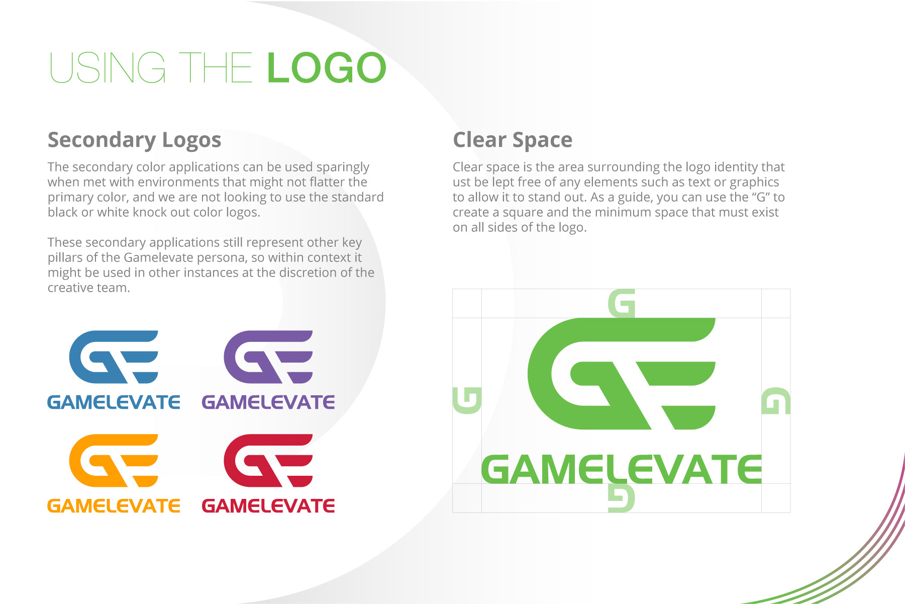
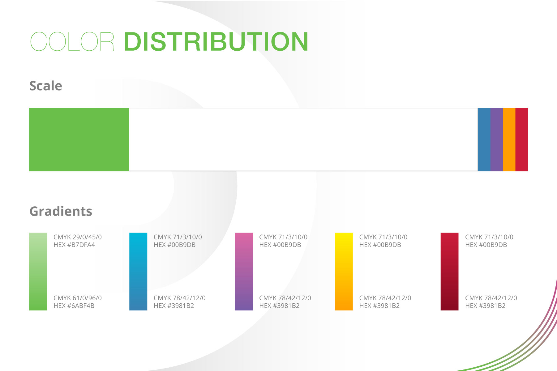
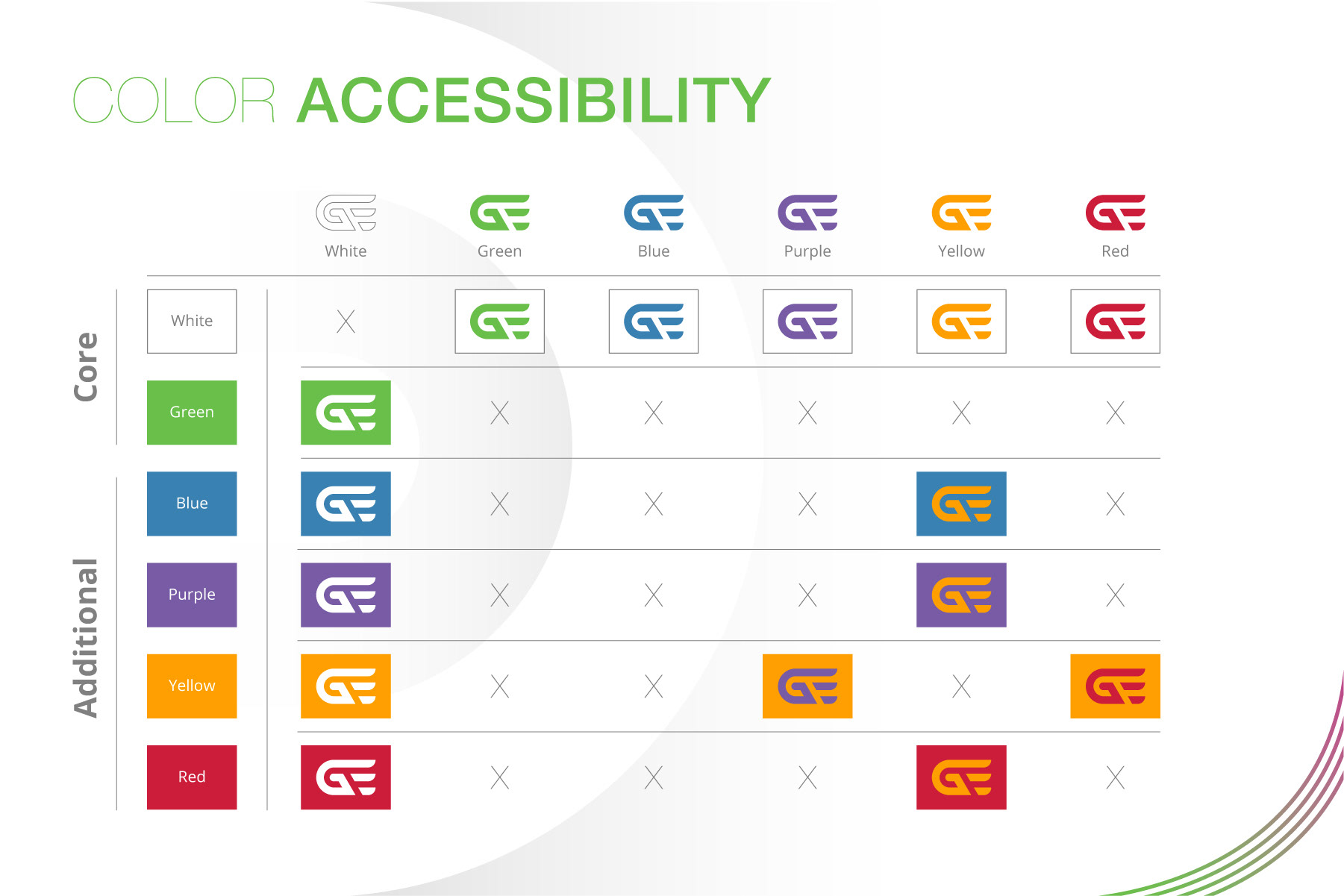
Using the all brand colors could help symbolize diversity but also allowed flexibility in displaying different content. for news pieces and digital content. I made sure the distribution was included to make sure it reinforced that elevation. The biggest challenge though would become imagery.
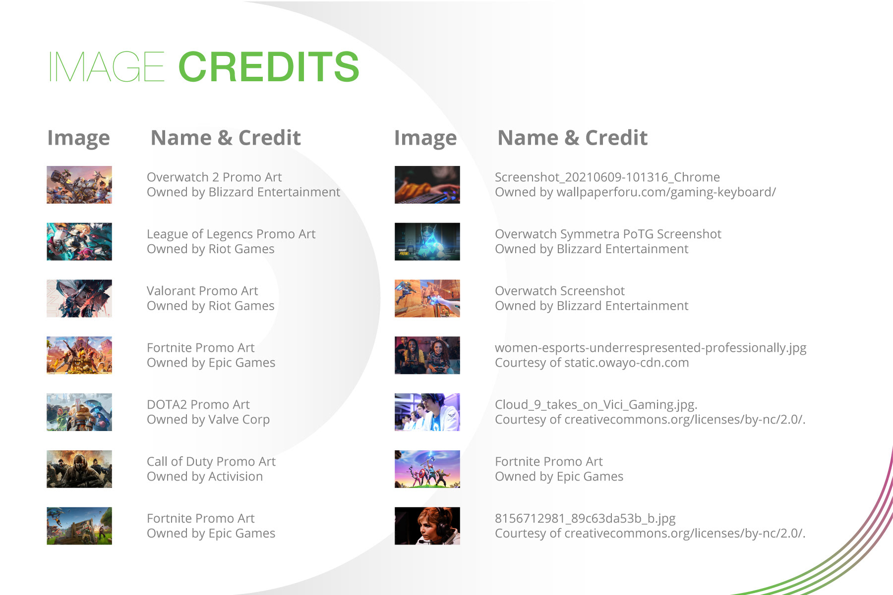
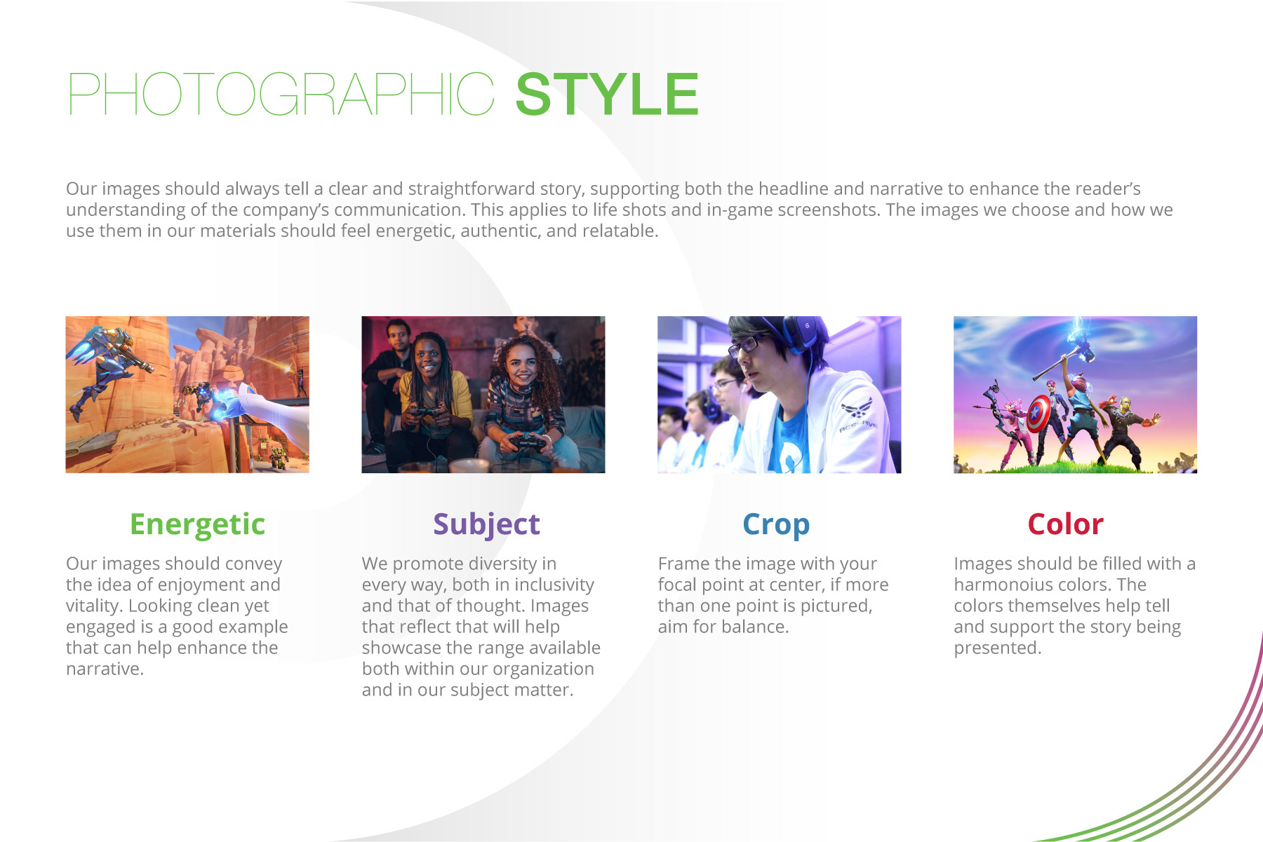
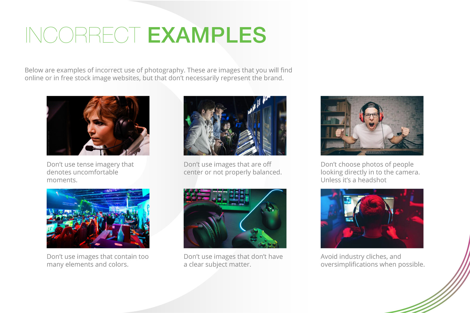
There was plenty of in-game content to draw from, but we needed something with a touch of the real world as well. If this was a brand aimed at consumers then it needed people, gamers specifically who were living the key pillars established earlier.
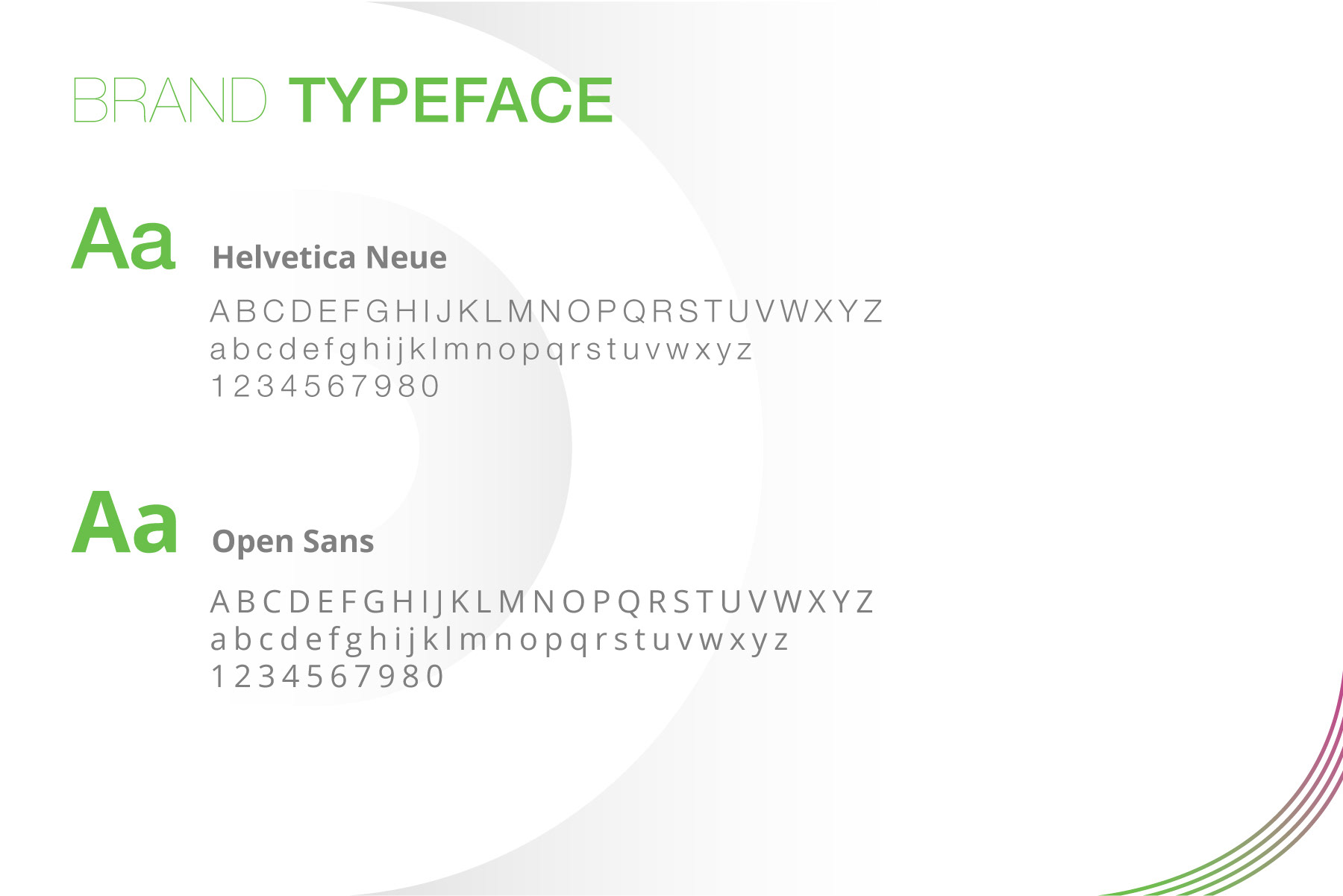
Adopting a font was one of the most critical components, it needed to be accessible and clear, as this was going to be adopted on the Gamelevate website, legibility was important, but it also needed to show how the company was operating at a higher tier. Helvetica and Open Sans checked those boxes and still allowed for some flexibility in other creative pieces.
Gamelevate still continues to grow, expanding their viewership to over 20k viewers a week, and with each new project the brand ties it all together. This was one of the most notable highlights this year, as all of the tools and research lined up to give way to what I hope will endure and help Gamelevate in all their endeavos.