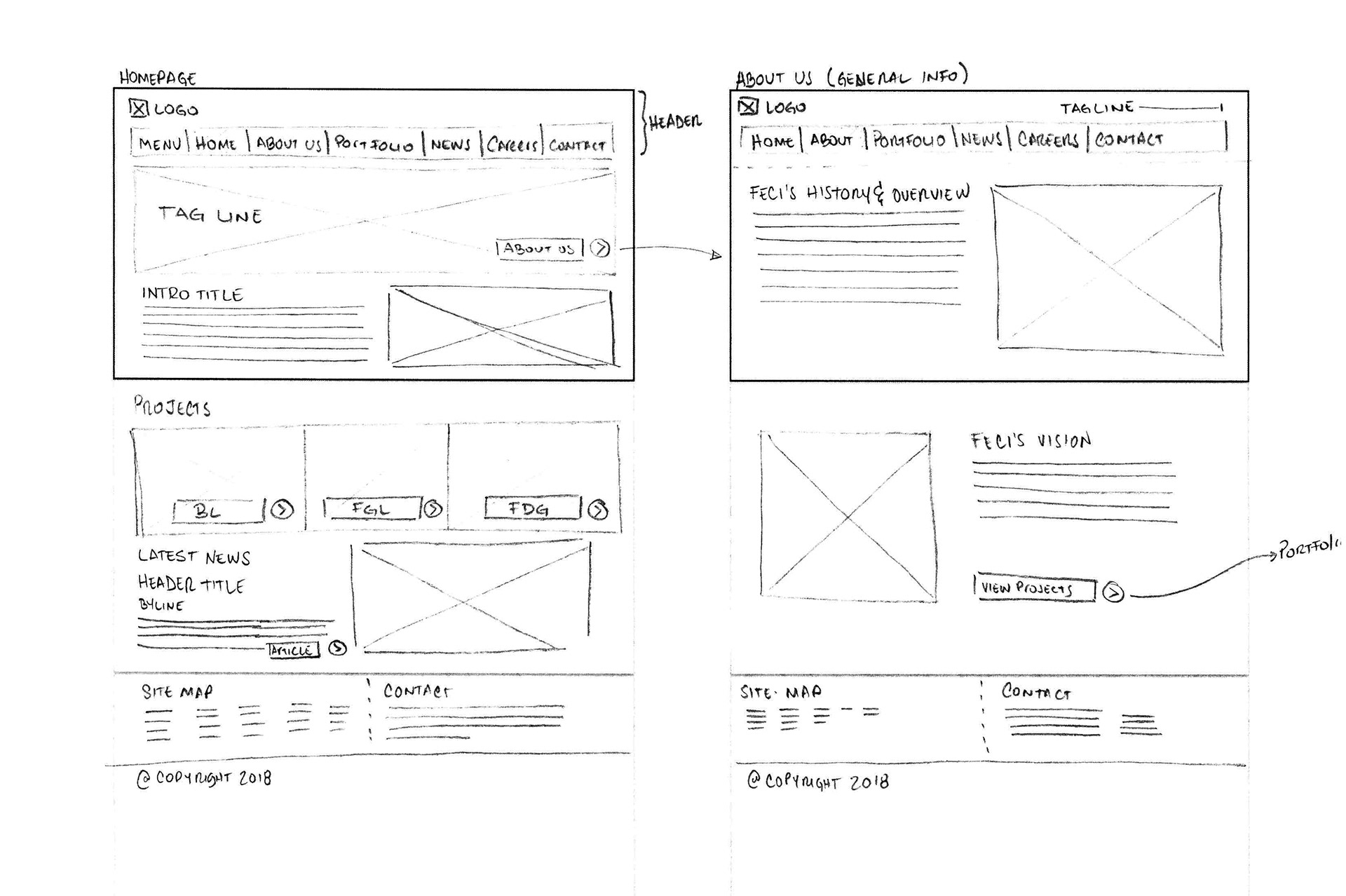
The website for Florida East Coast Industries was in need of a face lift, but more importantly to redefine how it wanted to approach their users. I begun by looking at the current function and framework of all pages. All content was broken apart through different pages, and most of them leading to dead-ends. So my first step was to reorganize and streamline the amount of pages a user could navigate across the whole site.
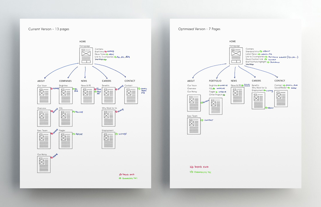
After analyzing it, I saw that first the content itself would need to be consolidated to minimize the amount of pages the user should visit. Second, each page would now give way to another page via links, in order to maintain a flow. After this was worked out and optimized, I now needed to design a wire-frame and possible layouts to plug in the information in a more efficient manner.
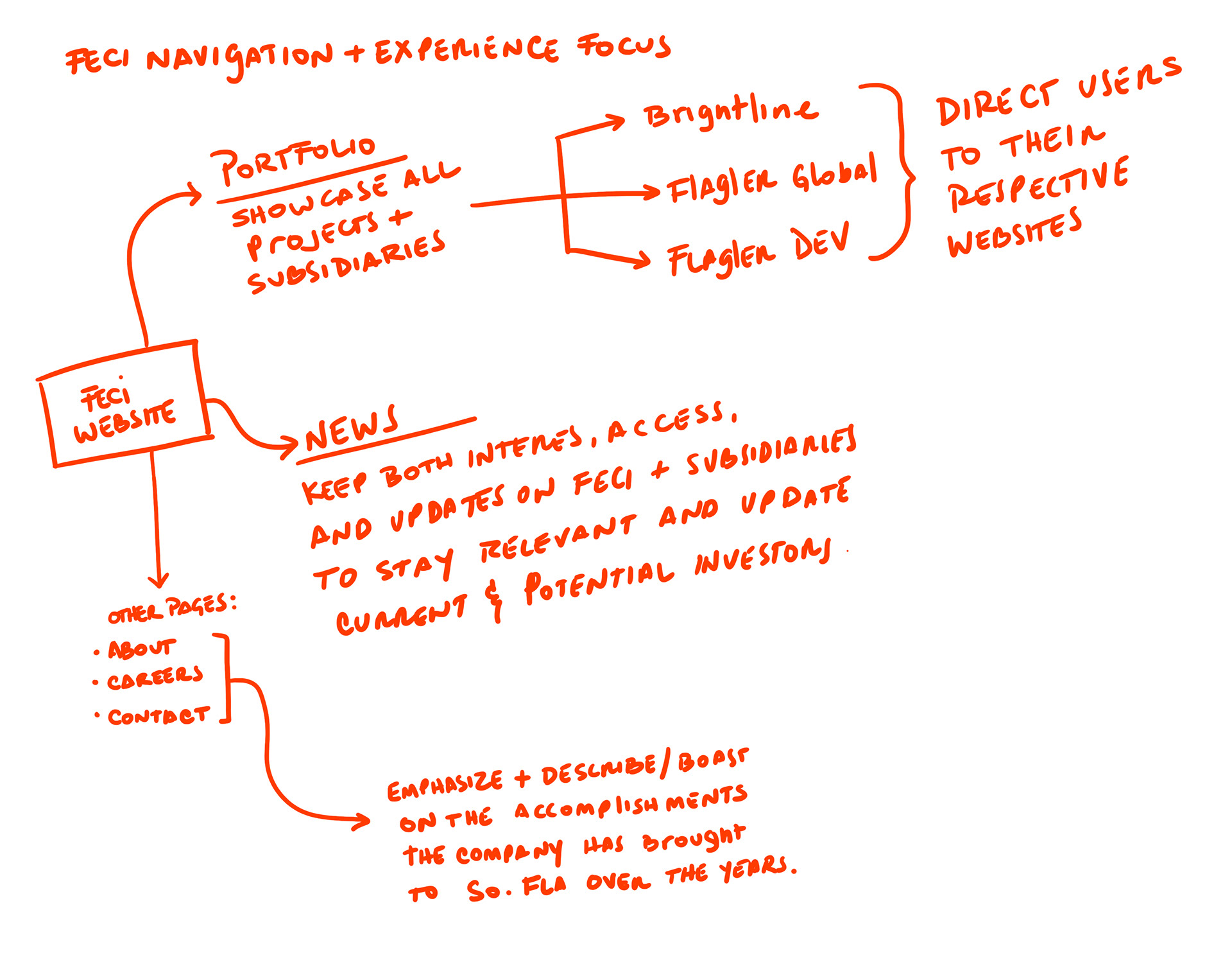
While working on the re-structuring of the website I wanted to make sure I kept some visual reference to remind me which pages areas of the website needed more focus and to highlight their purpose to always keep their respective goals in mind.
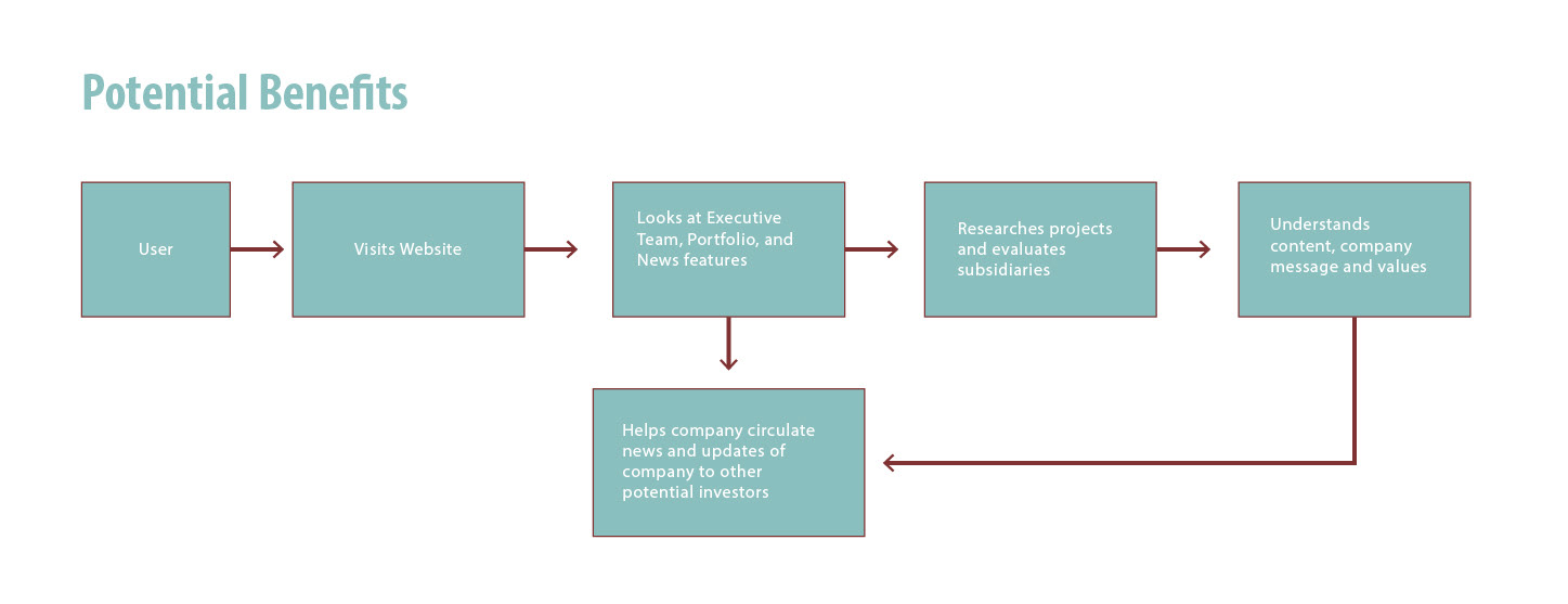
I took time to also highlight the main potential benefits to showcase the executives in the company, but also so I could use it as proper backing to the proposal I had presented to them. The main goal presented was to welcome them to the site, and redirect them to look in to the company's investment portfolio to potentially gain interest and support.
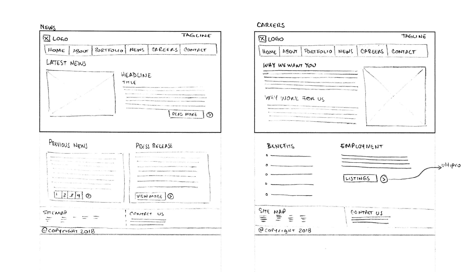
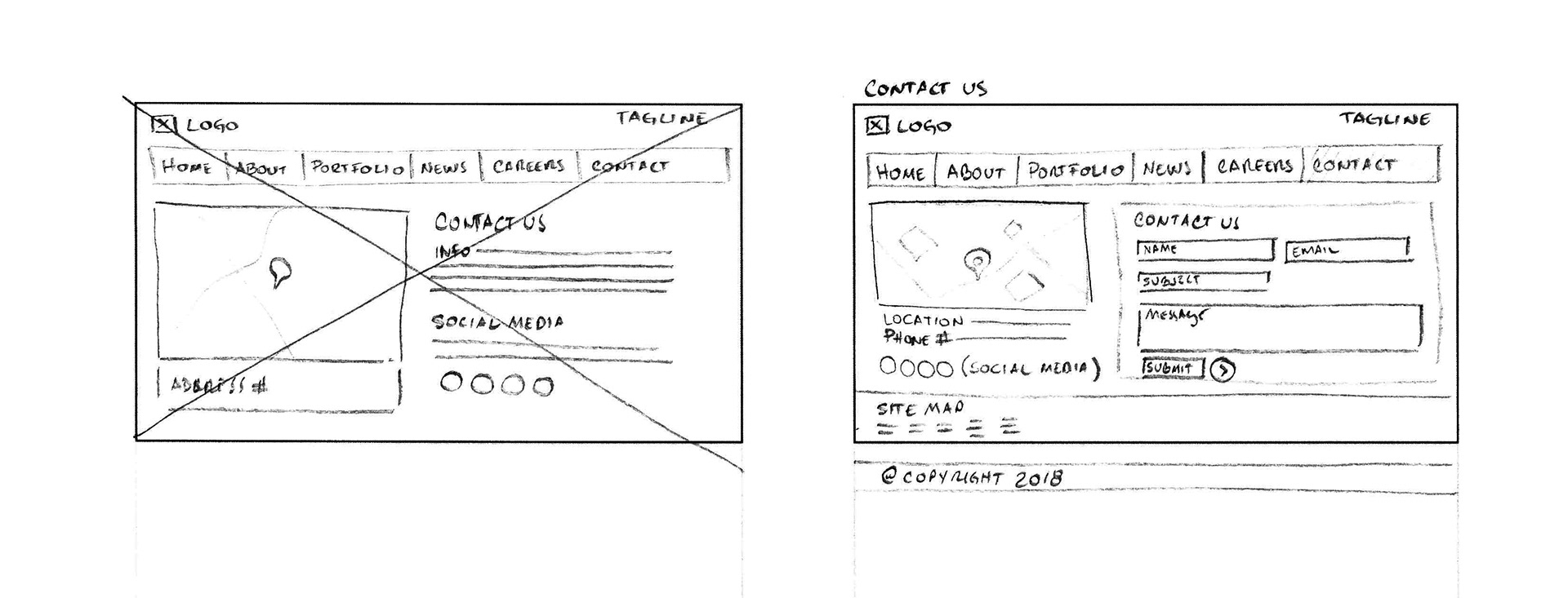
The wireframe came next to be able to organize the content and analyze what could be kept and what needed to go out in order to support the branding strategy.
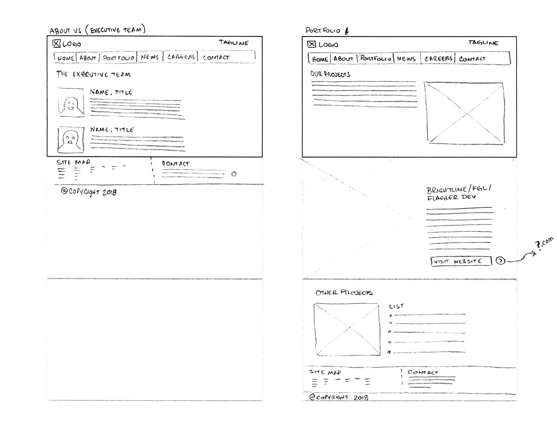
As I designed each low fidelity mock up, I noticed that the website also plugged in a lot of information for the sake of adding it, rather than creating with purpose. The pages dedicated to each of its subsidiaries functioned more like brochures, so I thought of creating a single page for all subsidiaries introducing them as part of a portfolio of investments which the use could see right away and visit if they were interested in them.
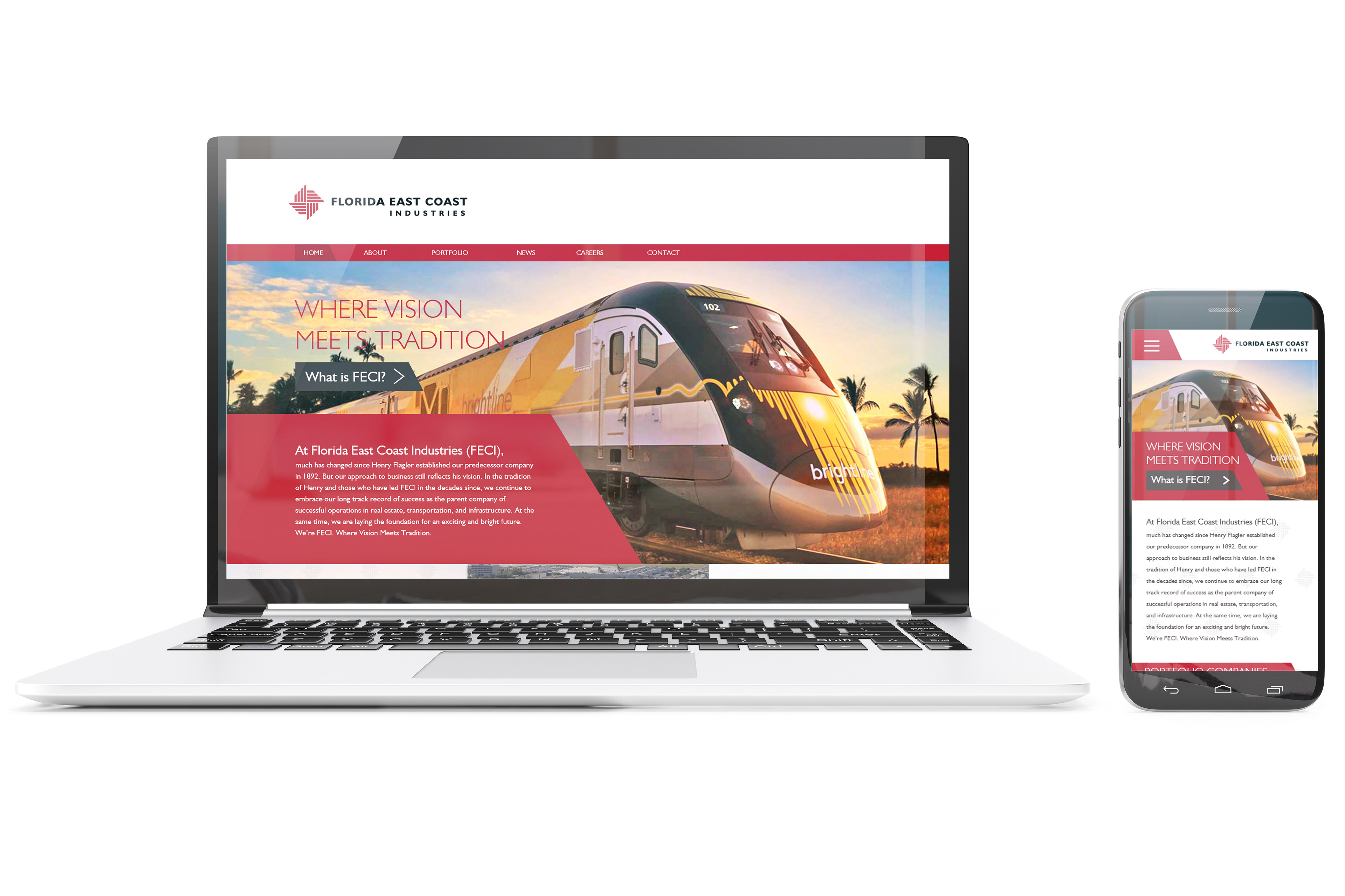
Once these issues were resolved I moved on to creating the new look for the website which would focus more on a more robust updated look versus the corporate layout it had before, this time focusing on the desktop and mobile version as well.
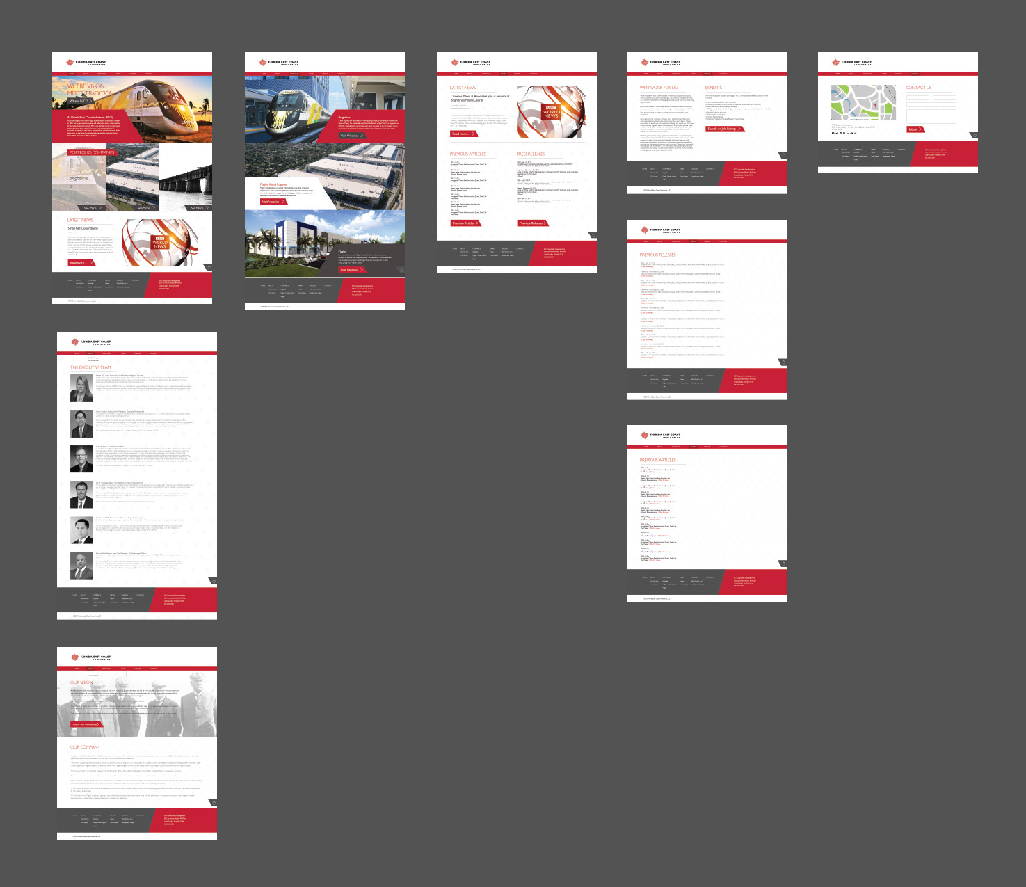
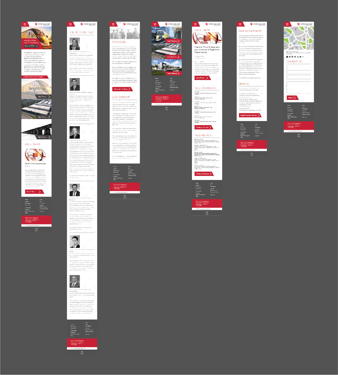
In the end the result became an efficient and direct adaptation of the previous website, which provided a much easier experience for its users and that reflected a modern look for the company.